| Image |
Comment |
| 07/31/2006 11:02:01 PM |
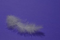
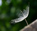
Floating in a Sea of Blueby karmatComment by Melethia: It's definitely quiet, but for a photograph, it's a little flat. The blue background looks a little blotchy and the feather doesn't really stand out. Maybe a bit better light on the feather itself or some adjustments to make it whiter would bring it out better. |
 Photographer found comment helpful. Photographer found comment helpful. |
| 07/29/2006 04:23:35 PM |
|
| Photographer found comment helpful. |
| 07/27/2006 10:20:50 PM |
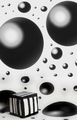
Longing to Fit Inby karmatComment by TheStick: Back to leave a comment!
A very cool shot! I gave it a 10 because I love the 3D feel of it! The title is very clever too!
Great shot! |
| Photographer found comment helpful. |
| 07/26/2006 07:54:53 AM |
Longing to Fit Inby karmatComment by xianart: a very nice image, but there seem to be some major compression problems, with jagged edges on the box and the stripes. how are you saving for DPC? |
| Photographer found comment helpful. |
| 07/26/2006 03:15:17 AM |
|
| Photographer found comment helpful. |
| 07/23/2006 04:31:26 PM |
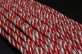
Break 10 of Tenby karmatComment by TooCool: From the Critique Club:
I can't believe that I drew a Karmat to critique! Whew the pressure! :-P
Boy, I don't know where to start with this one... First of all, I really think the idea is unique and I truly appreciate the work that you put into this concept. However...
With a studio set up shot like this, detail is everything. Hit them dead on and the shot works. Miss a couple and the shot suffers. Here, your striped 'balls' have lines that aren't straight. I know how hard it must be to try and paint straight lines on an egg, but to make this really work, they would have to be perfect. You also have several spots on several of the 'balls' where it looks like there is too much paint making it look splotchy.
There is another effect going on here that probably affected your score and that was mentioned by a couple of the commentors. This really looks distorted. I know that it's not, but that's what it LOOKS like. This makes the overall image look very distorted and hurts my eyes to look at it too long. Your lighting is a little flat and that makes the shot look flat overall. This seems to exagerate the distortion effect...
Overall, a nice idea, but one that I would be amazed to see pulled off to such a degree that it scores well here.
Hope this is helpful!
Yours,
TC |
| Photographer found comment helpful. |
| 07/23/2006 01:38:04 AM |
|
| Photographer found comment helpful. |
| 07/18/2006 05:01:00 PM |
|
| 07/15/2006 07:39:33 PM |
|
| 07/14/2006 03:36:46 AM |
Break 10 of Tenby karmatComment by redmoon: regrettably, it looks like a badly squished photo rather than what i guess are a bunch of a bit too realistically painted eggs. i am slightly worried that a lot of voters are not going to see the added depth of the subject matter here, because you did such a good job decorating them... i like it though - 7. |
| Photographer found comment helpful. |
Home -
Challenges -
Community -
League -
Photos -
Cameras -
Lenses -
Learn -
Help -
Terms of Use -
Privacy -
Top ^
DPChallenge, and website content and design, Copyright © 2001-2026 Challenging Technologies, LLC.
All digital photo copyrights belong to the photographers and may not be used without permission.
Current Server Time: 07/24/2026 06:25:43 AM EDT.