| Image |
Comment |
| 09/28/2008 01:00:01 AM |
Number 6.jpgby karmatComment by MattO: I like this, the dynamics are great, wish the interaction between the two subjects was better. And I agree there is either some artifacts or over sharpening done after last resize.
|
 Photographer found comment helpful. Photographer found comment helpful. |
| 09/27/2008 08:55:33 PM |
|
| Photographer found comment helpful. |
| 09/27/2008 12:40:39 PM |
|
| Photographer found comment helpful. |
| 09/27/2008 12:21:29 AM |
Number 6.jpgby karmatComment by karmat: I really didn't do anything but add a vignette to this, that I remember. I see what bvy is talking about, but I'm thinking that is resizing artifacts, etc. as it is not visible on the full size original. |
| 09/27/2008 12:13:59 AM |
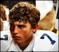
Number 8.jpgby karmatComment by bvy: Excellent! His eye color works well with that background. Good framing/vignette too. |
| Photographer found comment helpful. |
| 09/27/2008 12:12:51 AM |
Number 6.jpgby karmatComment by bvy: I like this but the processing strikes me as a bit rough around the edges in places -- around the dogs eyes and ears, for instance. It clashes with all those otherwise soft textures.
I do like the capture though -- it's a good snapshot. |
| Photographer found comment helpful. |
| 09/26/2008 11:00:44 AM |
|
| Photographer found comment helpful. |
| 09/25/2008 10:55:58 PM |
Intense 7by karmatComment by glad2badad: Greetings from the Critique Club
First Impression
Wonderful processing. Looks somewhere between a photo and a painting at first glance. There's a story here to be told that as a viewer I want to know more about.
Looking Deeper
Compositionally the subject and surrounding items fit together nicely. There are some triangular shapes that make this image comfortable, even if the viewer doesn't realize it. His face and head are roughly a triangular shape, the area in the upper right, and the upper left. Why do I mention this? Diagonals and basic triangle components in a comp are naturally pleasing to the eye, yet add a dynamic that will keep any photo from being static and uninteresting. At least that's what I read somewhere once. :-D Actually seems to work.
Even though the processing is substantial, you've kept a high level of detail. I really like the light highlights in his hair. Good tones (color temp) throughout. Possible minor nit is his proximity to the left edge of the frame and that he's looking out - some may frown on that in that he's taking the viewer out of the frame. Personally, I think it adds a touch of mystery to it...what's he looking at, etc...
The difference between the original and the post version is pretty substantial. The end result is very, very good. Congrats on a job well done! |
| Photographer found comment helpful. |
| 09/25/2008 12:50:33 AM |
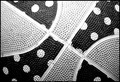
Girls Play Basketball Tooby karmatComment by kaiser_chief: Nice idea, but does not give a strong sense of colour. This could easily be a balck and white item. However, the texture is good, the composition also good. Would have been great with some more even light, as the upper part if overexposed, and the lower underdone. |
| Photographer found comment helpful. |
| 09/24/2008 09:17:10 PM |
Intense 7by karmatComment by bvy: Love this. Your post-processing is very original -- I can almost identify you by it. |
| Photographer found comment helpful. |
Home -
Challenges -
Community -
League -
Photos -
Cameras -
Lenses -
Learn -
Help -
Terms of Use -
Privacy -
Top ^
DPChallenge, and website content and design, Copyright © 2001-2026 Challenging Technologies, LLC.
All digital photo copyrights belong to the photographers and may not be used without permission.
Current Server Time: 06/25/2026 08:21:42 AM EDT.