| Image |
Comment |
| 01/24/2008 04:15:09 PM |
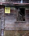
Postedby Donna21Comment by DrAchoo: Technicals: Lighting and processing are decent. One thing that jumps out to me is that other than the sign the color adds very little to the composition. Whenever I get a shot like this I immediately think about B&W. On this shot you could do B&W and possible a selective desat of the posted sign (although I'd not have the yellow blazingly saturated. I'd think about a half saturation or something like that). Composition seems a little cramped. I'd like to see more. Of course I don't now what else there is to see so perhaps it was out of necessity. By pulling back, you may also consider a landscape orientation instead of portrait.
The feel: Does feel abandoned. As I gather from your comments, you like the shed better in the summer and I'd probably agree. The bare tangle of briars is not nearly as nice as it would be with some color and leaves. What can you do? |
 Photographer found comment helpful. Photographer found comment helpful. |
| 01/24/2008 10:33:13 AM |
|
| Photographer found comment helpful. |
| 01/24/2008 12:15:53 AM |
|
| Photographer found comment helpful. |
| 01/23/2008 11:50:27 PM |
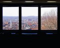
Hudson Valley Triptychby Donna21Comment by sethlfrench: Its like one of those pictures that people seperate on purpose but without the editing. I'm sure there's some artsy term for it but I'm uneducated. Nice though. |
| Photographer found comment helpful. |
| 01/23/2008 10:29:21 AM |
|
| Photographer found comment helpful. |
| 01/23/2008 10:21:34 AM |
|
| Photographer found comment helpful. |
| 01/23/2008 02:15:44 AM |
|
| Photographer found comment helpful. |
| 01/16/2008 09:20:48 PM |
Postedby Donna21Comment by stargazer05766: Presented nicely in the frame.. The vines coming out give dimension and dept to the shot.. And the posted sign is Perfect... Lot's of luck~~
Hope this makes it inthe top 10.... |
| Photographer found comment helpful. |
| 01/16/2008 09:04:33 PM |
|
| Photographer found comment helpful. |
| 01/08/2008 03:41:22 PM |
|
| Photographer found comment helpful. |
Home -
Challenges -
Community -
League -
Photos -
Cameras -
Lenses -
Learn -
Help -
Terms of Use -
Privacy -
Top ^
DPChallenge, and website content and design, Copyright © 2001-2026 Challenging Technologies, LLC.
All digital photo copyrights belong to the photographers and may not be used without permission.
Current Server Time: 07/16/2026 10:00:29 AM EDT.