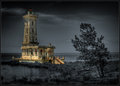
The Lighthouse at Point Abino - 1917by
david_cComment by macrothing:  Critique Club Critique
First Impressions
Critique Club Critique
First Impressions
Hmm, I remember pondering this image for a while during voting (I gave it a 5). I did like it, but the more I looked at it, as a whole and also the lighthouse exclusively, the more I didn't think the processing/selective desat suited, or rather, complemented the image/scene/lighthouse. But of course, it's your image and vision.
Photograph Information, Technicals & Composition Review
Difficult, because anything I 'suggest' is going to change the image completely, but I'll 'give' anyway - perhaps mine will be a unique view, which you can take or leave as you see fit. With the image as is, I think it is stronger with a more refined crop, especially at the bottom and on the left. I'm a little OC with horizons and while I see the dilemma with the lighthouse if the image is straightened, a perspective correction may have allowed some adjustments to be made - but I'll hazard a guess that it would be difficult to do.
As for the toning, maybe just more 'soft' and subtle with the b&w tones, to allow the lighthouse to dominate more. I just wonder whether the image all b&w (and I know it is 'another image') would have more punch - but it's an out of the box type style and I'm a fan of that. It's individual.
There are some nice elements in the scene/image: the tree, the 'log' just behind it (although the angle doesn't allow that to come into play much), the clouds behind the 'light'. The greenish glass is also nice and, of course in b&w, that couldn't be appreciated.
I don't know if it is your masking and processing, but I get a 'spriteish' feel coming from certain parts of the image.
Also - glad to see you are pleased with a print of this. The details underappreciated at this size probably come into play a lot better. Would certainly make an interesting talking piece.
Comments, Score & Placement Review
8/418 - well, excellent result for you. 6.85 is also an excellent score.
An average of 7.56 from your commenters, and some interesting reactions by them. I always like the honest feedback provided during the anonymity of a Challenge.
Summary
As is, with a selective desat, maybe a little softer with the tones. Otherwise, a bold and individual entry that brings an edge to the 'competition' - which is always good. You will never please everyone's eyes, as long as your eyes are 'pleased' - that's the main thing.