| Image |
Comment |
| 02/05/2008 05:03:13 PM |
|
 Photographer found comment helpful. Photographer found comment helpful. |
| 02/05/2008 03:20:16 PM |
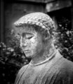
pensiveby beneeComment by twmax: Good DOF, and I like the textures. I'm not crazy about the vignetting...makes it look like the center of the photo was dodged. |
| Photographer found comment helpful. |
| 02/05/2008 01:24:24 PM |
pensiveby beneeComment by colorcarnival: I like the saintly glow around it. One thing I would have tried in addition to this is to burn some of the textures to create more of a contrast within the statue. But that's just me, contrast queen :) |
| Photographer found comment helpful. |
| 02/05/2008 10:46:03 AM |
pensiveby beneeComment by Sonifo: not over processed at all. I really like the texture and detail on his face. The background is a bit distracting but I do like the vignetting used. |
| Photographer found comment helpful. |
| 02/04/2008 11:33:20 AM |
IMG_3781-01.jpgby beneeComment by colorcarnival: This looks like something floating in and out of water. I'm not used to using grays - that is something i have to learn - so my personal preference leans towards seeing more contrast with the background (like a lighter background). This would make a great textures piece for those overlay projects. |
| Photographer found comment helpful. |
| 02/04/2008 12:28:55 AM |
pensiveby beneeComment by em3: I don't think it's over processed. It suits the subject perfectly. Well done! |
| Photographer found comment helpful. |
| 02/03/2008 10:44:28 PM |
pensiveby beneeComment by Veiolets: interesting statue and face. The image seems to contrasty for me. I want to see the fine detail in this one. |
| Photographer found comment helpful. |
| 02/03/2008 10:41:11 PM |
pensiveby beneeComment by Ken: I think Peter nailed my thoughts before I typed them. The effect is there, but it doesn't quite have that natural look, and a more subtle transition may have worked better. However, the B&W is strong and you've made a simple statue interesting to look at. |
| Photographer found comment helpful. |
| 02/03/2008 04:43:41 PM |
pensiveby beneeComment by pineapple: Visual metaphor and allusions are important tools in a photographer's kit, so you remind me. The cracks, tranquility, and bowed head, have symbolic meaning to me. |
| Photographer found comment helpful. |
| 02/03/2008 04:22:33 PM |
pensiveby beneeComment by bassbone: the crop and the background work well together - i like the contemplative face of the statue - i am not a fan of the heavyhanded touch with the burn and dodge - i can see where you are trying to go - illuminate the statue so it glows or radiates - but i wonder if the transitions between the burn and dodge are too severe |
| Photographer found comment helpful. |
Home -
Challenges -
Community -
League -
Photos -
Cameras -
Lenses -
Learn -
Help -
Terms of Use -
Privacy -
Top ^
DPChallenge, and website content and design, Copyright © 2001-2026 Challenging Technologies, LLC.
All digital photo copyrights belong to the photographers and may not be used without permission.
Current Server Time: 07/16/2026 02:34:53 AM EDT.