| Image |
Comment |
| 07/21/2003 01:39:08 PM |
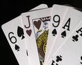
Odd Man Out.by macoxComment by alanfreed: You might have juiced the saturation of the reds a little better to make the Jack stand out a little more, but it's a great crisp image, and a nice concept. |
 Photographer found comment helpful. Photographer found comment helpful. |
| 07/21/2003 11:45:51 AM |
|
| Photographer found comment helpful. |
| 07/21/2003 08:44:14 AM |
|
| Photographer found comment helpful. |
| 07/21/2003 03:43:38 AM |
Odd Man Out.by macoxComment by Alpine99: Looked at this for ages... thinking (s)he should have used a red card.. Then I see that a heart is a red card.. but it looks grey.. Is it black and white? No, the yellow is still there.. In short.. good idea.. think you should have made the card redder..7 |
| Photographer found comment helpful. |
| 07/16/2003 08:01:17 PM |
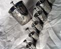
Round Reflectionsby macoxComment by Gallatin: This would be very effective on a solid back groung, try a hard piece of board, I think black or white would work nicely. I love your composition and I like the stainless steel cylinders for your subjects. |
| Photographer found comment helpful. |
| 07/16/2003 07:06:51 PM |
Round Reflectionsby macoxComment by barahoo: Well done. Might have had more impact if the backround material had been a color, possibly a pastel that would still show the wrinkles. |
| Photographer found comment helpful. |
| 07/16/2003 04:38:46 PM |
|
| Photographer found comment helpful. |
| 07/16/2003 12:58:12 PM |
|
| Photographer found comment helpful. |
| 07/16/2003 12:13:30 PM |
|
| Photographer found comment helpful. |
| 07/16/2003 08:21:16 AM |
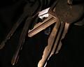
Hmmmm..... I Wonder.........by macoxComment by inspzil: Greetings from the Critique Club
By Inspzil
Composition - Well I don't think this was the most fitting photo for the challenge. Its not that it doesn't fit. I don't like the way that the keys are separated in 2 bunches, the lights and the darks. I'd have made some of the secondary light keys to bridge to the dark for a little pseudotransition. The 2 keys in the foreground should be given a little turn or something so that they look like 2 keys. They sorta look like one if you aren't looking hard enough. There is a little too much dark area here too. There are quite a few keys there, enough to fill up a little more of the frame methinks.
Technical - Not a badly taken picture at all. Good focus, the lighting differences provide a little contrast. The medium DOF is working pretty well. The bakcground keys are visible, though not really focused like the ones in the foreground. I think you used this well to get our focus more on the front keys.
Overall - I think a little too ordinary of a subject. Its not really one we are seeing in a different light or in a different way. Its just too straight up I think to do well here. It doesn't have a lot of fancy colors. I think with the key theme it might've been better to find a ring of keys with most or all of the keys the same. It really neeeds something though to make it a little more unique. Good luck in future challenges - Bob |
Home -
Challenges -
Community -
League -
Photos -
Cameras -
Lenses -
Learn -
Help -
Terms of Use -
Privacy -
Top ^
DPChallenge, and website content and design, Copyright © 2001-2026 Challenging Technologies, LLC.
All digital photo copyrights belong to the photographers and may not be used without permission.
Current Server Time: 07/16/2026 07:37:57 AM EDT.