| Image |
Comment |
| 06/10/2003 01:27:59 AM |
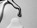
Wet Paint.by macoxComment by qachyk: Why black and white? I like the swirly paint effect but think it would have been much more effective in colour (unless, I suppose, you are using black and white paints, in which case a coloured background would have been nice; this renders it a bit bland). |
| 06/10/2003 12:22:32 AM |
|
 Photographer found comment helpful. Photographer found comment helpful. |
| 06/09/2003 11:26:38 PM |
Wet Paint.by macoxComment by frisca: If you got close up to that striped drop, I think you'd have a very strong composition, the contrast in this shot is great! |
| 06/09/2003 11:23:35 PM |
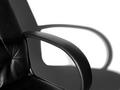
Office Shadowsby macoxComment by CLarson557: Nice shapes and shadows. The picture is crisp and clean. I think, if possible, I would have liked to see more of the chair in the picture. Other than that, a nice simple photo. 8 Good luck in the challenge. |
| Photographer found comment helpful. |
| 06/09/2003 02:37:10 PM |
|
| Photographer found comment helpful. |
| 06/09/2003 11:46:03 AM |
Office Shadowsby macoxComment by Mitonski: Nice choice... I'd be interested to find out whether it is a black and white shot or just the black chair and white painted wall which meant it didnt need a conversion. Nice picture. Mitonski |
| Photographer found comment helpful. |
| 06/09/2003 01:37:22 AM |
Wet Paint.by macoxComment by 61dynamic: Very nice shot. I like the contrast in the black and white paint from that one stream in the middle. The balance could be better. There's too much empty space to the right IMHO., but thats hard to controll if the paint was flowing.
Overall, it has very good detail and tones. |
| Photographer found comment helpful. |
| 06/08/2003 09:34:46 PM |
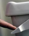
Flushhhhh!by macoxComment by adine: Great idea! A sound we all hear every day. I like the composition, but wish things were in sharper focus, and would like to see what ot looks like in b&w. |
| Photographer found comment helpful. |
| 06/08/2003 04:04:35 PM |
Wet Paint.by macoxComment by Lizz: I like the idea....but composition I find a bit awkward....maybe flip 90 left or right or tighter crop around paint dribbles....could be a bit sharper - more dramatic b&w. |
| Photographer found comment helpful. |
| 06/08/2003 05:14:43 AM |
Flushhhhh!by macoxComment by GeneralE: Well that's about the most tasteful toilet art I've seen on the web, but I wish it didn't look like it has become unfastened and you're tipping it over. |
Home -
Challenges -
Community -
League -
Photos -
Cameras -
Lenses -
Learn -
Help -
Terms of Use -
Privacy -
Top ^
DPChallenge, and website content and design, Copyright © 2001-2026 Challenging Technologies, LLC.
All digital photo copyrights belong to the photographers and may not be used without permission.
Current Server Time: 07/15/2026 11:53:51 PM EDT.