| Image |
Comment |
| 11/01/2009 04:01:54 AM |
|
 Photographer found comment helpful. Photographer found comment helpful. |
| 10/20/2009 09:31:28 PM |
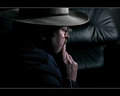
Pondering a Self Portraitby TerComment by snaffles: Greetings from the Critique Club!
Initial impression: Good execution, but needs a little more work in terms of concept.
Technical: Not much to pick holes here. Comp is a bit centred, lighting is good, the textures show nicely...almost too nicely, as the f-stop is maxed out at 29, so the leather couch is just as much in focus as you are! I would have gone for an f-stop of say 7.1, got ISO down as much as possible and compensated accordingly in terms of shutter.
Artistic: To me, the body language looks very closed-off to the viewer, as though you were disinterested. And yes, do find the sheen on the leather to lead my eye more to the back, whereas it should be roaming around the front. Would have liked to see more of a profile or 3/4 to the camera, this is almost 3/4 the other way.
Overall: Would love to see more of your face! From what I can see there are so many stories there for you to tell, let us see so we can get a sense for who you are.
Feel free to PM me with any questions,
Susan |
| Photographer found comment helpful. |
| 10/08/2009 02:02:43 AM |
Pondering a Self Portraitby TerComment by ASTONishing: the shot seems to be focused on your hand instead of your face. I think you should have cropped it as portrait instead of landscape....from just in front of the brim of the hat to just behind the ear. |
| Photographer found comment helpful. |
| 10/07/2009 01:59:47 PM |
Pondering a Self Portraitby TerComment by aj1621: I really like the shot of your subject, it draws you in. I think the leather in the background is a bit distracting though. |
| Photographer found comment helpful. |
| 10/05/2009 05:35:44 AM |
|
| Photographer found comment helpful. |
| 10/02/2009 12:21:29 PM |
|
| Photographer found comment helpful. |
| 10/01/2009 08:09:26 PM |
Cogs n Crossesby TerComment by George: If it weren't for the harshness of the lighting on the straight thing on the right, and the little black thing on the left (I'm assuming you're using it to frame the cog, it's just not working for me), I'd give it an 8. Speaking of lighting, the lighting on the cog is great, and really brings out the details. 7
Just a note - the black part of your border seems smaller on the top and left. If that's correct, try resizing to something like 700x??? first and then adding the border. |
| Photographer found comment helpful. |
| 09/28/2009 09:06:04 PM |
|
| Photographer found comment helpful. |
| 09/17/2009 08:24:47 AM |
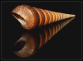
Spiralby TerComment by Covert_Oddity: I was shocked to see how this image scored, until I realised what challenge you had entered it into :)
I imagine if you had entered it into a more relevant challenge or free study it would have had a 6+ score, it's a wonderful shot, interesting and perfectly lit, with the reflection topping it off just nicely. |
| Photographer found comment helpful. |
| 09/08/2009 09:01:23 AM |
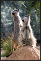
Meer Curiosityby TerComment by desertoddity: i was your high voter. i think it's a great shot. i wish it had done better for you. i hope someone has given you some critique on why it did not. |
| Photographer found comment helpful. |
Home -
Challenges -
Community -
League -
Photos -
Cameras -
Lenses -
Learn -
Help -
Terms of Use -
Privacy -
Top ^
DPChallenge, and website content and design, Copyright © 2001-2026 Challenging Technologies, LLC.
All digital photo copyrights belong to the photographers and may not be used without permission.
Current Server Time: 07/17/2026 12:15:59 AM EDT.