| Image |
Comment |
| 01/18/2010 09:28:19 PM |
|
 Photographer found comment helpful. Photographer found comment helpful. |
| 01/18/2010 08:56:20 AM |
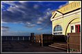
PaW 2010 Week 3.jpgby TerComment by caseyface: While I love the colors and tone here, I am not too drawn to the subject matter. Maybe you could go closer on the round window on the left of your frame. The blue handicap sign and the green one on the bottom right distract me. If you can go back to the same location and take some different shots, I think you'll really end up with something memorable (either of the building's architecture or the seascape), especially with your great eye for colors. |
| Photographer found comment helpful. |
| 01/18/2010 08:41:33 AM |
|
| Photographer found comment helpful. |
| 01/18/2010 06:37:36 AM |
PaW 2010 Week 3.jpgby TerComment by kellymk: Great contrasting colours and also nice contrast between the brooding sky and very geometric architecture. |
| Photographer found comment helpful. |
| 01/17/2010 09:41:41 PM |
|
| Photographer found comment helpful. |
| 01/17/2010 02:20:07 PM |
|
| Photographer found comment helpful. |
| 01/17/2010 08:27:03 AM |
|
| Photographer found comment helpful. |
| 01/17/2010 08:20:34 AM |
PaW 2010 Week 3.jpgby TerComment by Covert_Oddity: I think you've kind of ended up with a half and half situation here. You can only really see half of the building so it's not standing out as the subject and you can only half see the water so it's not really the subject either.
You've got nice exposure and details here, so I think either a wider angle or focus more on one or the other and this would be a nice shot. |
| Photographer found comment helpful. |
| 01/16/2010 11:21:23 PM |
PaW 2010 Week 3.jpgby TerComment by sulamk: This is very good , Have you tried another angle or shooting from low down so that the pier leads the eye to the building or sky! also try emphasising the texture of the pier! |
| Photographer found comment helpful. |
| 01/16/2010 06:15:33 PM |
|
| Photographer found comment helpful. |
Home -
Challenges -
Community -
League -
Photos -
Cameras -
Lenses -
Learn -
Help -
Terms of Use -
Privacy -
Top ^
DPChallenge, and website content and design, Copyright © 2001-2026 Challenging Technologies, LLC.
All digital photo copyrights belong to the photographers and may not be used without permission.
Current Server Time: 07/17/2026 03:21:56 AM EDT.