| Image |
Comment |
| 03/10/2010 03:40:58 PM |
|
 Photographer found comment helpful. Photographer found comment helpful. |
| 03/10/2010 01:50:38 PM |
|
| Photographer found comment helpful. |
| 03/10/2010 06:14:44 AM |
|
| Photographer found comment helpful. |
| 03/08/2010 09:52:13 PM |
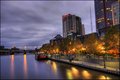
Majestic Melbourneby TerComment by Gatorguy: Hi, Critique Club here.
Welcome to the middle of the road, zero comment club. ;)
I like all the colors in the image, you did a good job of processing multiple images without losing anything.
When I first looked at the image, I thought is was crooked, but then I saw the lens you used and figure it's just distortion. I think that since it's allowed in advanced editing, you should have straightened it out so all the verticals are vertical. The other thing is that the trees give an illusion of softness in the image, but it's probably just the wind moving them slightly during your exposures.
I think if those two points were corrected, this would have scored better. |
| Photographer found comment helpful. |
| 03/07/2010 08:16:19 AM |
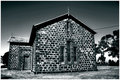
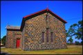
PaW 2010 Week 9.jpgby TerComment by Tammster: Wow, this is one of the most contrasting B&W pictures I've ever seen! This is really a great shot... perfect except for the wire (photoshop it out!). :o) |
| Photographer found comment helpful. |
| 03/06/2010 07:03:36 AM |
PaW 2010 Week 9.jpgby TerComment by kaiser_chief: Black and white is way better Terry. Makes the stonework a feature of the image, whereas the colours seemed to dominate the colour version. The contrasts between the different stone shades and the mortar really works well. Also means the patchy grass isn't noticeable. haven't you been getting the recent rains? |
| Photographer found comment helpful. |
| 03/06/2010 03:22:05 AM |
PaW 2010 Week 9.jpgby TerComment by Germaine: I like both shots, but this really brings out the pattern in the stonework. You can still pick out that banding in the sky, though. |
| Photographer found comment helpful. |
| 03/06/2010 03:20:28 AM |
|
| Photographer found comment helpful. |
| 03/05/2010 10:26:23 PM |
|
| Photographer found comment helpful. |
| 03/04/2010 07:38:33 AM |
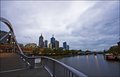
Bridge Over Not So Troubled Waterby TerComment by Covert_Oddity: I see Melbourne has been having the same weather as Sydney lately!
I think those clouds have provided you with a flat light that's let you down a little. I see some of the comments say it's let down by the composition, but I'm not so sure. I think with some good shadows in there it would become instantly much more interesting! |
| Photographer found comment helpful. |
Home -
Challenges -
Community -
League -
Photos -
Cameras -
Lenses -
Learn -
Help -
Terms of Use -
Privacy -
Top ^
DPChallenge, and website content and design, Copyright © 2001-2026 Challenging Technologies, LLC.
All digital photo copyrights belong to the photographers and may not be used without permission.
Current Server Time: 07/16/2026 12:08:46 PM EDT.