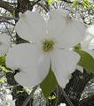
DPChallenge: A Digital Photography Contest You are not logged in. (log in or register
 
Browse Settings
Currently viewing:
Registered Userdraney4

Show comments:

Per page:

Order:

Comments:


Comments Received by draney4
Pages:   ...
Showing 171 - 180 of ~217
Image Comment
MANS LAST RIDE
05/06/2003 01:37:06 PM
MANS LAST RIDE
by draney4

Comment by frisca:
This is rather morbid (which can be effective in its "shock" value),but I'm afraid this doesn't meet the challenge, and is additionally a bit dark and out of focus with washed out colours. Try using software to saturate the colours and play with the brightness and contrast perhaps? :)
MANS LAST RIDE
05/06/2003 06:52:31 AM
MANS LAST RIDE
by draney4

Comment by Gerrit:
This is way off subject, I'm afraid. In the title it says "ride", but in the picture there's no ride, at best there's a destination reached a long time ago.
Dogwood
05/02/2003 10:18:23 PM
Dogwood
by draney4

Comment by karmat:
CRITIQUE CLUB CRITIQUE
by karmat

Dogwoods are a favorite of mine as well, and I have heard that "explanation" of them, too. Don't know if it is true or not, but it is a nice story. :-)

I have studied and looked at this picture a lot over the past couple of days. Though it is a fairly nice shot, and a great subject, I think a couple of adjustments could really give it some "wow" factor. I think the first thing that I notice is that the crop is a bit tight. Though you want the subject ot fill the frame, this feels crowded to me. Maybe if you pull the crop back some, and allow the main subject to be in the left or right third it wouldn't feel static, but would give the eyes somewhere else to "roam" and come back to.

The next thing I noticed is that teh exposure is great. The whites are nice and bright without blowing out, and the greens are shiny or bright, but a nice deep color. I think a slightly larger picture would show the defintion or details of the petals nicely.

The focus is okay for me, but the actually flower seems less sharp than some of the stuff in the background. I have found that it helps to make sure what I want in focus is in the very middle of my viewfinder or lcd, push the "shutter" halfway, let it focus, then reframe to get the framing I want. I don't know if your Nikon works the same way or not though.

Lastly, don't be afraid to play with the angle of shots. This looks head on, but it kinda gives me the impression that the flower was above your head. For some reason, it makes me feel like I am reaching to it. If this is so, try to find one closer to eye level or lower, then play with taking the picture from all different angles. Below, above, behind, to the sides, etc.

I do think this shot has a lot of potential, and I enjoyed looking at it. I hope this "critique" didn't sound over negative. If you have any questions or comments, please feel free to PM me and we can discuss it!

karmat
Compromise
05/02/2003 06:22:51 AM
Compromise
by draney4

Comment by inspzil:
Good story here. I think a lot of these pics sort of missed the boat on that one. I don't really care for the heavy green border though.
Photographer found comment helpful.
Compromise
05/02/2003 01:16:04 AM
Compromise
by draney4

Comment by tomzinho:
i love the sequence, but the focus seems soft, the photos are not quite sized/aligned right, and the pea soup green background? the photo on the right says it all ;-)
Photographer found comment helpful.
MANS LAST RIDE
05/01/2003 02:03:03 PM
MANS LAST RIDE
by draney4

Comment by Allen:
very intresting way of shooting this topic i think that it lacks the bold and stand out colors that would make it an even better picture than it already is
Photographer found comment helpful.
Compromise
05/01/2003 01:01:58 PM
Compromise
by draney4

Comment by Swashbuckler:
Really cute series and it tells a story, too. The bird bath scene is distinguishable, but can't really see the bird (it's the brown spot, right?). Cat Food scene is so very cute and the cleanup, just too cat-like. All three scenes are sharp, but so small the detail is difficult to see. I try to stay away from frame comments, but I'm sorry, this color isn't really pleasant (no score affect). 7 Rob the Swash
Photographer found comment helpful.
MANS LAST RIDE
05/01/2003 12:19:10 PM
MANS LAST RIDE
by draney4

Comment by sherryk471:
Looks over sharpened to me.
Photographer found comment helpful.
MANS LAST RIDE
04/30/2003 04:07:59 PM
MANS LAST RIDE
by draney4

Comment by brentg3:
I cant see the transport connection here in your picture?
Photographer found comment helpful.
Compromise
04/30/2003 03:28:49 PM
Compromise
by draney4

Comment by RiderGal:
I'm not sure whether it's compression or really your focus, but all of the photos look blurry. Cute subject... but not really interesting... I also don't care for the color or the layout... try getting down on the cats level... really get in it's face. Go for bigger photos, and don't use so much border.
Photographer found comment helpful.
Pages:   ...
Showing 171 - 180 of ~217


Home - Challenges - Community - League - Photos - Cameras - Lenses - Learn - Help - Terms of Use - Privacy - Top ^
DPChallenge, and website content and design, Copyright © 2001-2025 Challenging Technologies, LLC.
All digital photo copyrights belong to the photographers and may not be used without permission.
Current Server Time: 06/22/2025 08:54:10 PM EDT.