| Image |
Comment |
| 10/13/2009 06:35:35 PM |
|
| 10/09/2009 12:31:43 AM |
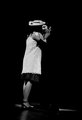
Leaning Inby SpongetoastComment by dustingooding: Meets Challenge: 2 of 3. Looks more like an underexposed B&W, than what I would consider low key. Yes, it's technically low key... but...
Technical: 2 of 3. I know you're dealing with stage lighting, but her hat's shadow on his face breaks the scene.
Emotion: 1 of 3. I dunno, they kinda look like mannequins up there. Maybe it's the complete lack of his body and the lack of definition in hers from her shirt that make it look so... uninteresting?
Awe: 0 of 1. |
| 10/04/2009 04:02:07 PM |
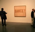
Dance?by SpongetoastComment by Yo_Spiff: I like the image itself, however your post processing and saving of it needs a bit more work. The white balance gives a decidedly unattractive cast to this and there is a ton of JPEG compression taking away detail and creating some visible artifacts. I copied it into PaintShop Pro top see, and found I could fix the white balance, but most other adjustments brought out even more pixelated JPEG artifacts. |
| 10/04/2009 02:19:05 PM |
Dance?by SpongetoastComment by Hye5: Hmmm... not sure what to make of this. Certainly, there are straight lines in this, but it appears that the focus of the image is merely the lines in the artwork. I think this might be more effective without the people and somehow using the straight lines of the wall/floor (maybe even the corner wall of the room) and the art frame as significant points of interest. |
| 10/03/2009 10:51:47 PM |
Dance?by SpongetoastComment by Ken: I'm guessing the picture is what you consider straight, but I'm seeing a lot of other things in your photo to draw my eye. |
| 10/03/2009 10:22:20 PM |
Dance?by SpongetoastComment by gg3rd: Though the subject matter is not not attractive, it does fit the challenge. Having said that I see many down sides with the image. The focus is soft and the lighting is flat. There seems to be no relation between the people on the image with the "Dance" theme. It would be more effective not having nobody in the frame at all (it would be more boring too...). The persons are cropped out - with exceptions, cropping or cutting people/limbs is not a good thing to do. |
| 09/30/2009 03:13:19 PM |
|
| 09/30/2009 06:34:18 AM |
Dance?by SpongetoastComment by Melethia: My kinda respose to the challenge. :-) Perhaps a wee bit of white balance adjustment, or convert to B&W, as the yellowish tinge may be a bit offputting. I like the partial peeps on the right. It seems as though they may be considering the suggestion. |
| 09/28/2009 09:01:04 PM |
|
| 09/27/2009 09:29:54 PM |
|
Home -
Challenges -
Community -
League -
Photos -
Cameras -
Lenses -
Learn -
Help -
Terms of Use -
Privacy -
Top ^
DPChallenge, and website content and design, Copyright © 2001-2026 Challenging Technologies, LLC.
All digital photo copyrights belong to the photographers and may not be used without permission.
Current Server Time: 07/16/2026 11:20:06 PM EDT.