DPChallenge: A Digital Photography Contest You are not logged in. (log in or register
 
Browse Settings
Currently viewing:
Registered UserSpongetoast

Show comments:

Per page:

Order:

Comments:


Comments Received by Spongetoast
Pages:   ... ...
Showing 141 - 150 of ~345
Image Comment
Good Times
12/26/2008 06:42:23 PM
Good Times
by Spongetoast

Comment by Covert_Oddity:
Don't really see any shadows here, and while it's a nice enough shot, it doesn't seem to meet the challenge to me.
Photographer found comment helpful.
Good Times
12/26/2008 11:01:29 AM
Good Times
by Spongetoast

Comment by bvy:
A fun image with good organic energy (huh?) but not really about the shadows.
Photographer found comment helpful.
Good Times
12/26/2008 02:38:11 AM
Good Times
by Spongetoast

Comment by dafletchr:
I think this is a nice picture/processing, but I don't see the shadows. Maybe it's just me. Sorry.
Photographer found comment helpful.
Good Times
12/26/2008 01:29:53 AM
Good Times
by Spongetoast

Comment by jomari:
Although there is light and shade here, there is no emphasis on shadows.
Photographer found comment helpful.
Good Times
12/25/2008 09:53:45 PM
Good Times
by Spongetoast

Comment by slipintoshadows:
It's an interesting picture, but I don't see any shadows.
Photographer found comment helpful.
Good Times
12/24/2008 05:39:19 PM
Good Times
by Spongetoast

Comment by mgarsteck:
Good stuff! 7
Holding Hands
12/09/2008 05:12:47 AM
Holding Hands
by Spongetoast

Comment by ericwoo:
Hey there from the Critique Club

Camera Work/Technical: yospiff hit this one on the head. Your compression makes this one very hard to judge or consider the technicals of the image.

Lighting: It is backlit, but the lighting is way too harsh. The sun really washed out your image and created a very distracting lens flare.

Composition/Content: I like what's there, I just don't think that it fits well into this challenge. I know, the challenge is about lighting. Still, I'd like to see this one in a street challenge with better execution.

My Opinion: I think that the score fits, and I think that there is lots to be learned from this one. You did meet the challenge, but execution would have been much stronger. It seems like more of a snapshot that a well thought out image. I think that this capture scored about where it should have.

Thank you for the opportunity to provide a critique on your entry,
Eric
Photographer found comment helpful.
Holding Hands
12/02/2008 10:17:05 PM
Holding Hands
by Spongetoast

Comment by Yo_Spiff:
Seems a snapshot, I'm afraid. There is some flare in the upper right that you could have cropped out, but the major problem to me is JPEG compression.

Your file size of only 61k indicates a highly compressed image and that is what is robbing a lot of the detail and sharpness from this image. artifacts are especially visible in the pattern of the pavement. Check your compression settings when you save your file. Always adjust JPEG compression so that your file size is as large as possible, but within the challenge limit. (150k for this one)

I don't know what you use for editing, of course, but I have posted an example and some notes on the compression settings in PaintShop Pro. Other programs should be similar, though not identical:

Hope this is helpful for you.
Rocking Out At A Concert
12/01/2008 09:13:21 PM
Rocking Out At A Concert
by Spongetoast

Comment by Daybis:
Greetings from the Critique Club Shirley!

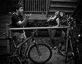
First Impression: My first impression was that this looked like a snap shot, but a bit better.

Composition: I like the over all composition, but there are something that you might want to change. In the black area of the photo there are some white spots that are distracting that could have been cloned. Some similar spots can be seen on the edge of the overhang. The lighting is decent for what your were shooting. Exposure is good. If you didn't use a tripod, you have very sturdy hands. The red lettering above the marquee is also grainy and I would have liked to have seen entire name of the place the concert was held. It also appears that the light bulbs on the overhang were the focus point instead of the letters on the sign.

Subject: This subject really doesn't tell my anything about where art may have gone. I could see that it might be possible to assume that he went to a concert.

Creativity: This photo doesn't look overly creative to me. This looks like a snapshot and your comments reinforce that idea.

Improvements: To improve the photo, fix some of the things I have mentioned above. Use the clone tool in photoshop to get rid of the spots. You could also use USM to sharpen the photo a bit. You should have also tried to implement some of Art's personality into your photos like some of the other photographers did.

My Thoughts: This photo has potential, but because some of the fine details were overlooked, the image fell short.

Overall, it's an ok photo. I hope my critique has been help and informative If you have any questions please PM me.

Cheers,
Ron
Photographer found comment helpful.
Holding Hands
11/28/2008 05:42:17 PM
Holding Hands
by Spongetoast

Comment by kingskingdom:
Gets extra marks from me just because the man has got his girlfriend to carry his hockey stick. My wife would never carry my sticks back from a game. Nice idea, slightly overexposed
Pages:   ... ...
Showing 141 - 150 of ~345


Home - Challenges - Community - League - Photos - Cameras - Lenses - Learn - Help - Terms of Use - Privacy - Top ^
DPChallenge, and website content and design, Copyright © 2001-2025 Challenging Technologies, LLC.
All digital photo copyrights belong to the photographers and may not be used without permission.
Current Server Time: 06/17/2025 06:23:20 AM EDT.