| Image |
Comment |
| 01/26/2004 05:58:08 PM |
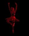
DANCING WITH LIGHTby ColeyComment by adine: The effect seems creates movement in the still object. Is it the texture of the dancer that makes the light points? or did you create that with the application? The placemnt of the dancer is interesting - why have more black on her right. I'd almost put more space for her to "move into" or balance the sides exactly. |
| 01/26/2004 10:30:36 AM |
DANCING WITH LIGHTby ColeyComment by TerryGee: I see some major problems here. Did you resize this? In the ballerina there are blocks. That usually occurs when the image was resized improperly. |
| 01/26/2004 09:59:14 AM |
|
| 01/22/2004 11:30:46 PM |
Night Treeby ColeyComment by Neil: Greetings from the Critique Club!
Hits: This is a good night shot; the subject is well exposed (and not overexposed as often happens). The texture of the tree shows very well, and the colors seem right. It's good you chose an off center composition for this.
Misses: The key interest in the photo is the network of branches at the top of the tree. As mentioned, the textures work well, and there's a nice "branching out" feeling. However, aesthetically, it seems to end too abruptly. I think it would work better if you could have gotten more of the branch area of the tree and include a little less of the trunk (assuming your flash would cover it). Perhaps a vertical format would help.
Ideas: One thing you could have tried which I think would have made this really a "stop and analyze" type of photo is a little trick, but legal. What if you were to flip this upside down? I think it would look pretty cool, and there's no rule against it. Maybe next time!
Regards--Neil
|
| 01/21/2004 11:20:30 AM |
|
| 01/21/2004 05:58:29 AM |
|
| 01/19/2004 09:50:55 PM |
|
| 01/18/2004 06:14:44 PM |
|
| 01/17/2004 09:13:41 AM |
Night Treeby ColeyComment by inspzil: This photo has a lot of depth. I don't think the negative space in this photo is working to enhance the subject. I think if you'd have cropped some of that off, you could've gotten we viewers closer to the subject and even added more depth to the photo. |
| 01/17/2004 08:27:33 AM |
|
Home -
Challenges -
Community -
League -
Photos -
Cameras -
Lenses -
Learn -
Help -
Terms of Use -
Privacy -
Top ^
DPChallenge, and website content and design, Copyright © 2001-2026 Challenging Technologies, LLC.
All digital photo copyrights belong to the photographers and may not be used without permission.
Current Server Time: 07/18/2026 08:56:24 PM EDT.