| Image |
Comment |
| 01/24/2008 06:31:29 AM |
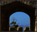
untitleby guitarmaniacComment by thierr26: I think it would be better with a tighter crop. The framing element is very dark and takes too much space in the image. |
| 01/24/2008 01:15:09 AM |
|
| 01/23/2008 07:20:01 PM |
untitleby guitarmaniacComment by BrianR: Like the clarity in the distant bridge, hard call on the amount of framing used, sometimes less is best...6 |
| 01/23/2008 05:15:27 PM |
|
| 01/23/2008 04:47:35 PM |
|
| 01/23/2008 09:54:27 AM |
|
| 01/22/2008 09:51:02 PM |
|
| 01/22/2008 04:15:26 PM |
|
| 01/22/2008 09:42:09 AM |
|
| 01/21/2008 08:49:32 PM |
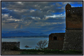
view of the seaby guitarmaniacComment by KeiraRose: The coloring looks cool but fake. There is a glow around the edges of the buildings. I'm not sure if this was the effect you wanted but it blatantly shows that the image was edited from its original version. You have a great angle though, I really like how my eyes are drawn out over the sea, almost like I'm looking out of a tower. Very nice work! |
Home -
Challenges -
Community -
League -
Photos -
Cameras -
Lenses -
Learn -
Help -
Terms of Use -
Privacy -
Top ^
DPChallenge, and website content and design, Copyright © 2001-2026 Challenging Technologies, LLC.
All digital photo copyrights belong to the photographers and may not be used without permission.
Current Server Time: 07/16/2026 12:03:56 PM EDT.