| Image |
Comment |
| 02/27/2008 01:05:33 PM |
|
 Photographer found comment helpful. Photographer found comment helpful. |
| 02/25/2008 09:05:15 PM |
|
| 02/25/2008 12:02:07 AM |
|
| 02/23/2008 10:35:25 AM |
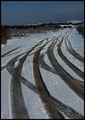
zebra streetby guitarmaniacComment by snellslaw: Overall the image seems under exposed and I think the composition would be improved if the road only had one set of tracks. Though I realize that might not have been possible. |
| 02/21/2008 12:08:41 PM |
zebra streetby guitarmaniacComment by Camabs: I am not sure whether there is an unambigious definition of leading lines, but in my book, they should be a line or several lines that lead the viewer's eye towards the main subject of the picture. I think that's not the case in this picture. Your pic uses a vanishing point rather than leading lines. |
| 02/20/2008 09:53:49 PM |
|
| 02/20/2008 04:22:34 PM |
|
| 01/28/2008 08:37:54 PM |
|
| 01/28/2008 02:19:08 PM |
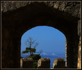
untitleby guitarmaniacComment by glad2badad: Couldn't think of anything for a title? :-/ I like the photo overall. You picked a nice framing element for this challenge entry. I did notice, when scrolling down to comment, that the image takes on a different feel when the top is cropped off (losing the top brick part). Not sure if it's "better" or not that way, just an observation. Good luck in the challenge. |
| 01/27/2008 12:36:25 AM |
|
Home -
Challenges -
Community -
League -
Photos -
Cameras -
Lenses -
Learn -
Help -
Terms of Use -
Privacy -
Top ^
DPChallenge, and website content and design, Copyright © 2001-2026 Challenging Technologies, LLC.
All digital photo copyrights belong to the photographers and may not be used without permission.
Current Server Time: 07/16/2026 12:44:38 AM EDT.