| Image |
Comment |
| 02/24/2012 11:11:31 AM |
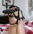
Black shoesby gorant71Comment by Denielle: I like the shoes. But the lighting is a bit off to me. I think if you had converted this to black and white, and maybe increased the contrast a bit, it would have really made the image pop. |
| 02/22/2012 05:31:10 AM |
Black shoesby gorant71Comment by SaraR: I find the vase growing out of he left-hand sole a little distracting, but otherwise a good crisp photo. I do wonder if a more feminine quilt cover may be in better keeping with the, presumed, seductress theme? |
| 08/12/2008 10:11:31 PM |
|
| 08/12/2008 07:28:18 PM |
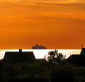
Evening by the seaby gorant71Comment by jerryc12: This looks oversharpened or processed in Photoshop or some other program. The wide border at the horizon looks artificial unless it really is a breakwater. |
| 08/12/2008 01:28:39 PM |
|
| 08/12/2008 08:27:10 AM |
Evening by the seaby gorant71Comment by dsa157: soemthing looks really artificial in this shot - it may just be due to oversharpening as the horizon line and the edges of the house and trees are too contrasty. also. I am not crazy about how the chimney top is right on the edge of the horizon. I would have liked it framed a little higher or lower. |
| 08/11/2008 10:13:35 AM |
Evening by the seaby gorant71Comment by rarmermann: Interesting photo but the reflection of the sunlight on the water is a bit distracting. The orange sky gives the photo a nice feature but because of the distraction of the glare it has taken the lime light away from the sky. Which in my opinion is the main feature in the photo. Making the sky crisp and toning down that glare the photo would have been much better. |
| 08/11/2008 03:16:10 AM |
Evening by the seaby gorant71Comment by mstone: I have to be honest here, when I first looked at the image, it looked like it was two images connected together because of the contrasting colors I think you should have darkened the ship a bit to help bring the photo together. It would have been balanced more that way. Even after looking at it over again, it really does look like two photos spliced together. Im not saying that it is. Perhaps the foreground is a tad distracting. I don't know. There is just something about the image that doesnt balance out right for me. good luck in the challenge! :) |
| 08/10/2008 03:55:59 AM |
|
| 08/09/2008 09:27:57 AM |
|
Home -
Challenges -
Community -
League -
Photos -
Cameras -
Lenses -
Learn -
Help -
Terms of Use -
Privacy -
Top ^
DPChallenge, and website content and design, Copyright © 2001-2026 Challenging Technologies, LLC.
All digital photo copyrights belong to the photographers and may not be used without permission.
Current Server Time: 07/02/2026 10:34:33 AM EDT.