| Image |
Comment |
| 06/27/2007 05:45:11 PM |
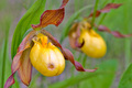
M'Lady's Slipper by cpanaiotiComment by DrAchoo: The techicals: Composition is good. We get a nice echo motif with the second flower. Lighting is good, but not dynamic (ie. it's flat). Processing lets the shot down in my eyes. I can instantly see the highlight/shadow effect and that probably means you did too much. It further leads to the "flat" look.
The feel: I'm not sure where the picture is going. The subject is sort of sedate and still lifeish (which isn't bad), but the processing doesn't go with this idea and tries to give it an "edge" (at least in my eyes).
The game: The negative space was not negative enough. While you do have a large portion that is not occupied by the main subject, it is occupied by a secondary subject and the voters probably didn't take too kindly to that. |
 Photographer found comment helpful. Photographer found comment helpful. |
| 06/25/2007 06:11:34 PM |
M'Lady's Slipper by cpanaiotiComment by Sheryll: I don't think I would've picked one with a whole in it but it doesn't really hurt the image. The negative space isn't what I would've thought for this challenge but that's just me. Technically this shot is very good. the clarity of the front slipper is good, the comp is good, the colores are nice and pleasing. |
| Photographer found comment helpful. |
| 06/23/2007 12:32:17 AM |
|
| Photographer found comment helpful. |
| 06/22/2007 08:02:33 PM |
|
| Photographer found comment helpful. |
| 06/18/2007 11:37:15 PM |
|
| Photographer found comment helpful. |
| 06/18/2007 09:32:31 PM |
|
| Photographer found comment helpful. |
| 06/18/2007 03:47:33 PM |
100%by cpanaiotiComment by Melethia: Nice idea for the challenge and I like the creative composition of this. |
| Photographer found comment helpful. |
| 06/17/2007 03:27:24 PM |
|
| Photographer found comment helpful. |
| 06/17/2007 12:41:18 AM |
100%by cpanaiotiComment by BlackNewfs: I really like this image - very nicely composed and I like the concept. I wish the colours were more vibrant though, to me the oranges look a little flat. Perhaps the lighting wasn't quite right? I like it though...gave you an 8 |
| Photographer found comment helpful. |
| 06/15/2007 09:49:47 AM |
|
| Photographer found comment helpful. |
Home -
Challenges -
Community -
League -
Photos -
Cameras -
Lenses -
Learn -
Help -
Terms of Use -
Privacy -
Top ^
DPChallenge, and website content and design, Copyright © 2001-2026 Challenging Technologies, LLC.
All digital photo copyrights belong to the photographers and may not be used without permission.
Current Server Time: 06/24/2026 08:35:55 AM EDT.