| Image |
Comment |
| 05/07/2007 10:34:39 AM |
|
| 05/07/2007 10:09:11 AM |
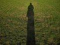
The Shape of Me...by mian3010Comment by cpanaioti: Shadows can be interesting however I think the impact of this image could be improved if a vertical format were used. This would emphasize the height of the shadow. |
 Photographer found comment helpful. Photographer found comment helpful. |
| 05/06/2007 01:16:10 PM |
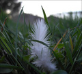
Featherby mian3010Comment by Haneck: Pretty! It might be better if you changed the composition around a bit - and maybe had the feather to the side instead of straight on in the center. Also the lighitng could be a little brighter. But otherwise this is really pretty - your focus is PERFECT! |
| Photographer found comment helpful. |
| 05/05/2007 01:58:34 PM |
|
| Photographer found comment helpful. |
| 05/04/2007 07:02:04 PM |
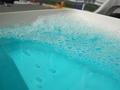
Funby mian3010Comment by BAMartin: Greetings from the critique club.
I am going to critique this without reading any of the comments you have already received, so if I repeat something already said, please forgive me.
I really like the color of the water, it is reminicent of the Caribbean Ocean. The bubbles are nice too, but maybe not quite big enough, or enough of them to stand as the sole subject of the photograph.
I think if you had cropped thight you wouls have rid yourself of a distracting background and been closer to the action, so to speak.
Overall this is not a bad image. You might want to try it again moving in closer and having some really big shiny bubbles. I hope this critique has helped. |
| Photographer found comment helpful. |
| 05/04/2007 12:25:21 PM |
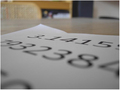
PiPaperby mian3010Comment by seb-ksl: The idea could have make it but... There's some disturbing points: the background isn't simple enought to keep the eye on the subject, and in my opinion the fonts of the number are too big or you are too close, and the lighting could have been used, too. |
| Photographer found comment helpful. |
| 05/04/2007 11:11:28 AM |
PiPaperby mian3010Comment by surfdabbler: The DOF and the low angle make it hard to see what this actually is. Be careful of your backgrouns - this background is not relevant to the shot, and is distracting. Experiment more with different lighting. Lamps are great because you can move them around and easily experiment with different lighting for a small scene. |
| Photographer found comment helpful. |
| 05/04/2007 09:01:33 AM |
PiPaperby mian3010Comment by eqsite: This looks like an experiment in shallow depth of field, but the composition doesn't work well for it. It seems like the goal was to have the begining of the number in sharp focus and then have it fade off out of focus as it continues, thus demonstrating the infinity of pi. However, the table top, chair and the rest of the background distract from this. It would be a stronger message if the all we saw was the white paper and numbers on it instead. |
| Photographer found comment helpful. |
| 05/04/2007 08:02:23 AM |
|
| Photographer found comment helpful. |
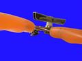
| 05/04/2007 07:08:06 AM |
Canopenerby mian3010Comment by atupdate: Hello from the Critique Club,
A very creative image of a can opener. When I first opened this image, I didn't know which challenge this was entered into and I didn't read the title right away. As I looked at it a few thoughts came to my mind, "What a neat perspective of someone holding up an object on their fingertips, I wonder what lens was used", "Those fingers look a bit over processed - too much neat image", and "The post processing of this image could have been a little cleaner".
Overall, this image meets the challenge topic very well. The colors are very vibrant but this works against you here a little bit, as the orange plastic handles are not very appealing. Since the perspective of the subject is rather unique, I feel that the color of the handles gave the voter an easy excuse to vote a 4 or 5 and not spend the time figuring out the perspective.
There are a couple of post-processing issues related to switching the background from white to blue. On the top of the left handle you can see a slight halo effect and the handle looks jagged where your layers mask didn't quite meet up with the handle before converting the white to blue. There is also a section on the bottom of the right handle where it is easy to see where the blue conversion carried over into the handle material. Masking to convert the background color is very tricky and requires a lot of work at high magnification to clean up the layers mask. As you practice this technique more, you will find you will improve.
With a different can opener and a bit more practice with the post processing, this image could easily of scored in the 6's. This image shows that you have a good eye for composition and I know your score will improve as you enter more challenges.
Feel free to PM me if you have any questions regarding this critique.
Tim
|
| Photographer found comment helpful. |
Home -
Challenges -
Community -
League -
Photos -
Cameras -
Lenses -
Learn -
Help -
Terms of Use -
Privacy -
Top ^
DPChallenge, and website content and design, Copyright © 2001-2026 Challenging Technologies, LLC.
All digital photo copyrights belong to the photographers and may not be used without permission.
Current Server Time: 07/16/2026 01:48:09 PM EDT.