| Image |
Comment |
| 02/17/2003 12:55:04 AM |
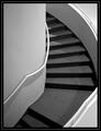
Ascensionby jmsetzlerComment by RLS: Very nice John... The contrast on this scene is excellent ... Congrats on a great image.
Bob |
| 02/16/2003 11:29:57 AM |
Ascensionby jmsetzlerComment by lisae: Very cool. Great rich black and white tones and lovely texture. The composition is really strong. |
| 02/15/2003 12:52:13 AM |
Ascensionby jmsetzlerComment by tfarrell23: Very Nice.... Sharp... Great Focus...you can see the spots on the Carpet...sheesh..One of the top photos in this Challenge |
| 02/14/2003 03:33:29 PM |
|
| 02/14/2003 02:14:00 PM |
Ascensionby jmsetzlerComment by karmat: Very graceful curves. I think cropping it at the landing so that the "curve" is not interrupted, and making it extend slightly right would have looked really nice to. |
| 02/14/2003 10:28:51 AM |
Ascensionby jmsetzlerComment by RiderGal: This is beautiful in black and white. Nice job! I love the shadows leading your eyes up the stairs. Excellent use of composition, leading lines, and great perspective. Perfect -10- Talya |
| 02/13/2003 05:54:51 PM |
Ascensionby jmsetzlerComment by Swashbuckler: Good shot of this stairway. Focus seems very sharp. Contrast is very good. Interest - moderate to low (sorry). 7 Swash |
| 02/11/2003 09:05:39 PM |
Ascensionby jmsetzlerComment by KarenB: beautiful sweeping curve. smooth looking and nice patterns. interesting to view. |
| 02/11/2003 03:19:40 PM |
|
| 02/10/2003 10:34:26 PM |
|
Home -
Challenges -
Community -
League -
Photos -
Cameras -
Lenses -
Learn -
Help -
Terms of Use -
Privacy -
Top ^
DPChallenge, and website content and design, Copyright © 2001-2026 Challenging Technologies, LLC.
All digital photo copyrights belong to the photographers and may not be used without permission.
Current Server Time: 06/18/2026 08:01:50 PM EDT.