| Image |
Comment |
| 04/11/2003 01:12:23 AM |
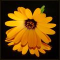
Symphony In F Majorby jmsetzlerComment by BigHusker001: Now...that's a pretty daisy shot. Well done. Simple, but elegant. The thin yellow border is a nice touch. Just to be picky, but stem stub is a bit clumbsy. Perhaps having it longer and extend off the picture would be better...or maybe not having a stem at all. |
| 04/10/2003 11:45:37 PM |
Symphony In F Majorby jmsetzlerComment by maddlyn: As much as I enjoy this photo, it is obvious that it was "staged" and I am more for the natural, spur-of-the-moment photograph. |
| 04/09/2003 10:49:29 PM |
Symphony In F Majorby jmsetzlerComment by inspzil: More pittsburg steeler fans.... THis is good except for the miror. I think there is defintely a time and a place for the mirror shots. Pretty good except for that. Nice color and well taken. |
| 04/09/2003 03:21:33 PM |
Symphony In F Majorby jmsetzlerComment by dsidwell: It might be the superb lighting, but this image uses light and space to create a mood that moves me and makes me think of not only the flower, but of its mystical origins. 10 |
| 04/09/2003 02:27:02 PM |
|
| 04/09/2003 11:32:00 AM |
|
| 04/09/2003 10:59:45 AM |
|
| 04/09/2003 02:23:37 AM |
|
| 04/09/2003 12:20:34 AM |
Tacticsby jmsetzlerComment by CreativeFlyPhoto: hey there from the Critique Club - hehe
this image is excellent .. the clarity and detail in the clear figures is amazing .. i do like the shallow DOF and the play in with the chessboard .. the placement of everything certainly portrays symmetry and the off balance in the background sets the complete composition off nicely ... I also do like the blue tones it gives it a warmer feeling - maybe even a more artsy feel to the photograph than if the shot was done in black and white ... my only thing is that the King looks like its slightly leaning to the right ... maybe it's just an illusion or the piece itself ... either way ... great job .. Ayme |
| 04/08/2003 07:13:33 PM |
Oasisby jmsetzlerComment by justine: CC Hi JohnBoy!
Fits The Challenge-* Mostly* yes.
Composition-Good except for the bobbed tail.
Background-Good
My Opinion-Technically: score of 90%.. -5 for the tail and -5 a bit dark. Both are minor and easily corrected or changed. Since we don't have something to compare the lizard to it's hard to tell the size and that is why I question the _fits the challenge_. Secondly the mirror. It took me a long time to see it. I will tell you once I did I thought it added to the shot. Last but not least ....the 'Oasis'. I don't see it well enough to recognize it for what it is. Now after reading your note and then later posts I know. I will tell you during the challenge I didn't have a clue what it was. It not a bad shot at all and has appeal. |
Home -
Challenges -
Community -
League -
Photos -
Cameras -
Lenses -
Learn -
Help -
Terms of Use -
Privacy -
Top ^
DPChallenge, and website content and design, Copyright © 2001-2026 Challenging Technologies, LLC.
All digital photo copyrights belong to the photographers and may not be used without permission.
Current Server Time: 06/19/2026 01:45:26 PM EDT.