| Image |
Comment |
| 05/11/2003 11:52:09 PM |
|
| 05/11/2003 11:24:14 PM |
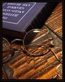
The Professorby jmsetzlerComment by inspzil: That looks like a stamping plate under the glasses. Very nice because it brings the wonderful coppery tones into this photo. Good shot |
| 05/11/2003 04:25:59 PM |
|
| 05/10/2003 02:45:02 PM |
|
| 05/10/2003 02:21:27 AM |
The Professorby jmsetzlerComment by f-32: Good interpretation of the theme. Excellent image. Thoughtfully composed, well lit, sharp, elegantly put together. And a clue to the photographer's identity, perhaps, in reverse. (Your father, David?) |
| 05/09/2003 08:14:38 PM |
The Professorby jmsetzlerComment by scab-lab: The lighting works great in this shot. The catchlight on the glasses and the shadow along the books edge really give the photo some depth. The colors are great, and I wonder if anyone else caught the name on the typeset...lol maybe if they print out the shot and hold it too a mirror they will get it...lol |
| 05/09/2003 06:50:38 PM |
|
| 05/09/2003 10:51:57 AM |
|
| 05/09/2003 09:30:55 AM |
The Professorby jmsetzlerComment by dsidwell: Your lighting and tones make this photo really shine. I like the small glare on the glasses. Interesting choice to use printing masters for the background. |
| 05/09/2003 06:42:16 AM |
|
Home -
Challenges -
Community -
League -
Photos -
Cameras -
Lenses -
Learn -
Help -
Terms of Use -
Privacy -
Top ^
DPChallenge, and website content and design, Copyright © 2001-2026 Challenging Technologies, LLC.
All digital photo copyrights belong to the photographers and may not be used without permission.
Current Server Time: 06/19/2026 09:14:18 PM EDT.