| Image |
Comment |
| 08/29/2003 03:43:29 AM |
|
| 08/28/2003 09:40:27 PM |
|
| 08/28/2003 11:31:00 AM |
|
| 08/28/2003 10:25:42 AM |
Soul Harvestby jmsetzlerComment by Gordon: Not sure I like this one so much - the out of focus regions just seem blurry to my eye - maybe gives me a ghostly impression or being dead, but doesn't quite work for me. The foreground cross is a strong tonal contrast to everything else, but it would maybe look better with a less over exposed look that kept some more of the texture ? The jumbled composition just feels haphazard and accidental - particularly the occluded 'murray' headstone on the right - I can't tell how much of this was intentional to make it look cluttered vs. accidentally arranged. |
| 08/28/2003 10:20:57 AM |
Peace In The Valleyby jmsetzlerComment by Gordon: Very well exposed and composed - not sure that I like the extremely shallow focus slice in this though, you've lost a bit of the front of the cross and the sliver of out of focus grass in the foreground is a touch jarring - maybe a stop or do wider to get the real subject all in focus while keeping the rest blurred would work better ?
The two white 'hot spots' (sky?) pull me away from the subject a bit too - try covering them with your hands - does it change how you view the picture ? I can see a 'pulling me upwards towards' heaven reason for them perhaps - but I find it better with those areas removed/ darkened - worth a play to see how it changes the picture.
Probably suffered from narrow views of 'garden' but seems right on topic to me... Message edited by author 2003-08-28 10:21:36. |
| 08/27/2003 09:57:18 PM |
|
| 08/27/2003 06:26:17 PM |
|
| 08/27/2003 10:06:22 AM |
|
| 08/27/2003 09:44:04 AM |
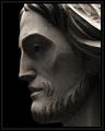
How Great Thou Artby jmsetzlerComment by rickhd13: This is nicely done, i like the profile aspect rather thatn a head on shot, I am not a big fan of borders but this is nice also, good composition, well done |
| 08/26/2003 06:09:58 PM |
How Great Thou Artby jmsetzlerComment by zeuszen: Neither subject nor manner of this statue (?) naturally appeal to me, personally. Nevertheless, I need to give credit for a well composed and excellent shot. Lighting and exposure, especially, are painstakingly and sensitively appropiate. |
Home -
Challenges -
Community -
League -
Photos -
Cameras -
Lenses -
Learn -
Help -
Terms of Use -
Privacy -
Top ^
DPChallenge, and website content and design, Copyright © 2001-2026 Challenging Technologies, LLC.
All digital photo copyrights belong to the photographers and may not be used without permission.
Current Server Time: 06/20/2026 11:54:23 AM EDT.