| Image |
Comment |
| 05/12/2007 03:23:52 AM |
|
| 05/10/2007 06:32:42 PM |
|
| 05/07/2007 09:39:24 AM |
|
 Photographer found comment helpful. Photographer found comment helpful. |
| 05/06/2007 10:12:37 AM |
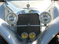
Del Cabrioletby dtremainComment by corinne: Excellent subject choice. It would be even more symmetrical if you had taken the photo dead straight on. Notice how the angle of the right fender is slightly higher than the left? |
| Photographer found comment helpful. |
| 05/05/2007 06:32:27 PM |
Del Cabrioletby dtremainComment by tosk: The photo looks like it could have been rotated a bit. The overexposed part on the top right detracts, I think. |
| Photographer found comment helpful. |
| 05/05/2007 02:12:56 PM |
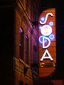
Club Sodaby dtremainComment by lkn4truth: CRITIQUE CLUB COMMENT
First impressions: The composition, colors, and focus are all quite good. Unfortunately, nothing impresses me about the photo. So why? There is no real "wow" factor which really helps in DPC voting because so many photos on DPC "wow" you it almost becomes expected. I think you did a great job photographically as far as picking the right shutter speed/apature settings to get a well exposed, crisp shot. The biggest reason I think it didn't score higher is that it has a sort of snapshot feel to it. In other words it appears as if no real effort went in to taking the shot. It is also taken from a perspective we are used to seeing signs at (i.e. shot from the stree looking up at the sign). It would help when shooting somewhat every day items to shoot them in some unique perspective we aren't used to seeing them at. In this example I might say shooting from a window on the side of the building and shooting down a bit on it to include the street MIGHT help. It is a bit of a shame it didn't score higher being that it certainly meets the challenge and it is well exposed and technically sound. |
| Photographer found comment helpful. |
| 05/04/2007 01:30:43 AM |
Del Cabrioletby dtremainComment by RPvanderHilst: I like this idea, though I would've liked it to be even better aligned. This gives it a bit of a snapshot-feeling, where perfect symmetry would raise the score I give now by at least two points. Also, the lighting is a bit strange from aright and I think I'd change the white balance. Still, I like the idea and wonder what images you'll produce in the future! -5- |
| Photographer found comment helpful. |
| 05/03/2007 04:56:03 AM |
|
| Photographer found comment helpful. |
| 05/02/2007 08:28:25 PM |
|
| Photographer found comment helpful. |
| 05/02/2007 07:40:06 AM |
Club Sodaby dtremainComment by dtremain: Originally posted by corinne:
In a contest that is filled with bubbles (literally), this photo was a nice change of pace. The photo was executed very well. My next comment is in no way a reflection of your photo - but isn't it a shame that an awesome, old brick building is littered with neon signs? |
Actually, this, and a series of bubbles up the side are the only modern signs on the building, and some of the original painted signs are still visible. Thanks for your comments. |
Home -
Challenges -
Community -
League -
Photos -
Cameras -
Lenses -
Learn -
Help -
Terms of Use -
Privacy -
Top ^
DPChallenge, and website content and design, Copyright © 2001-2026 Challenging Technologies, LLC.
All digital photo copyrights belong to the photographers and may not be used without permission.
Current Server Time: 07/15/2026 07:19:44 PM EDT.