| Image |
Comment |
| 09/24/2007 10:45:55 PM |
|
 Photographer found comment helpful. Photographer found comment helpful. |
| 09/24/2007 06:36:47 AM |
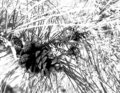
Pine Coneby dtremainComment by BeckyT: The pine needles are a little bright so it may be hard to get a print. But the pine cone is great. You have some great tones and focus. The cone really stands out. Good use of the rule of thirds. Good eye. |
| Photographer found comment helpful. |
| 09/23/2007 10:31:22 PM |
Pine Coneby dtremainComment by glad2badad: Looks nearly abstract with the hot highlights. Kind of fun to look at. May be hard to get a print of this if you ever wanted to.
Good eye to see this. |
| Photographer found comment helpful. |
| 09/23/2007 11:59:44 AM |
|
| Photographer found comment helpful. |
| 09/23/2007 12:19:12 AM |
|
| Photographer found comment helpful. |
| 09/23/2007 12:18:09 AM |
|
| Photographer found comment helpful. |
| 09/22/2007 01:47:21 PM |
|
| Photographer found comment helpful. |
| 09/22/2007 01:32:48 PM |
|
| 09/22/2007 01:19:27 PM |
|
| 09/22/2007 01:09:34 PM |
|
Home -
Challenges -
Community -
League -
Photos -
Cameras -
Lenses -
Learn -
Help -
Terms of Use -
Privacy -
Top ^
DPChallenge, and website content and design, Copyright © 2001-2026 Challenging Technologies, LLC.
All digital photo copyrights belong to the photographers and may not be used without permission.
Current Server Time: 07/17/2026 03:50:43 AM EDT.