| Image |
Comment |
| 03/10/2010 06:16:34 PM |
|
 Photographer found comment helpful. Photographer found comment helpful. |
| 03/10/2010 01:21:39 AM |
Curvesby dtremainComment by HarveyG: I came back, and now I know, thanks! Still great PP. The Title may have thrown voters in a Parallel Lines challenge... |
| Photographer found comment helpful. |
| 03/09/2010 06:46:30 PM |
|
| Photographer found comment helpful. |
| 03/09/2010 10:56:49 AM |
Trinityby dtremainComment by RUEDISCHMUTZ: Would I hang this on my wall. Perhaps, I like the composition. I judge on what I would hang in my apartment. You will have to live with my 7. Maybe later I pump up to a 8. Not sure at the moment |
| Photographer found comment helpful. |
| 03/09/2010 10:24:37 AM |
|
| Photographer found comment helpful. |
| 03/09/2010 09:16:02 AM |
Waitingby dtremainComment by eschelar: I agree with the others, the pic itself looks pretty cool with nice use of grain, but the borders gotta go.
I don't get 'waiting' either. |
| 03/09/2010 09:14:16 AM |
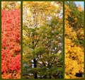
Autumnby dtremainComment by eschelar: I'm a sucker for triptych, so I'm biased, but I think it's pretty cool.
Again, I'm seeing too much in the reds. Do you check the histogram when editing? especially with the channels split? The pic on the red is quite muddy from being pushed too hard.
The one in the middle is suffering from highlights and the one on the right is... just right. |
| 03/09/2010 09:11:23 AM |
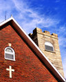
Old Country Churchby dtremainComment by eschelar: In the thumbs, this looks very striking. It seems a bit oversaturated in the blues though. This has also brought out a bit of unusual magenta stuff happening there as well.
Even in basic, a hue/sat layer and a selective color layer would have taken care of that I think. |
| 03/09/2010 09:07:53 AM |
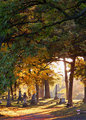
Beyond the Sunsetby dtremainComment by eschelar: I like the mood and the colors, but I'm having trouble with the intensity of light.
There's an area that works with the 'blooming' effect of the strong light and blown highlights. However, there's also a ton of channel clipping and overly strong highlights through the rest of the pic that seem 'less than ideal'.
Specifically the highlights in the leaves on the ground in the light and the strong reflection off the gravestones on the right. For these areas of highlight, a bit of a circular gradient on a second exposure would probably do a lot of good for the shot, HDR style.
I like the lightness in the shadow areas on the gravestones, especially with the colors there. |
| 03/09/2010 09:02:25 AM |
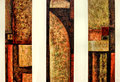
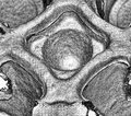
Architectureby dtremainComment by eschelar: As a raw texture study, I quite like this. It has a nice abstract look.
It's oversharpened and I like it for this pic. |
Home -
Challenges -
Community -
League -
Photos -
Cameras -
Lenses -
Learn -
Help -
Terms of Use -
Privacy -
Top ^
DPChallenge, and website content and design, Copyright © 2001-2026 Challenging Technologies, LLC.
All digital photo copyrights belong to the photographers and may not be used without permission.
Current Server Time: 07/29/2026 07:02:35 AM EDT.