|
|
|
Showing 201 - 210 of ~229 |
| Image |
Comment |
| 06/01/2007 08:56:58 AM | |
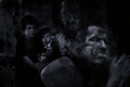
| 06/01/2007 08:24:21 AM | Please Stopby btrinhComment by Dirt_Diver: This is a good display of the picture talking and not the title. So an extra point for that. It's too dark IMO but the darkness really makes this hole image work. The processing is good almost like a grundge effect but it looks like you went crazy with the didge tool on the smokers face. |
| 06/01/2007 01:40:31 AM | Please Stopby btrinhComment by digitalknight: use your tonal range to draw our attention to them - it's all kind of one tone and my eye has to work to find what you are showing me. The strong subject in the foreground dominates from a size perspective, so lighten the kids to give my eye a reason to move to the story you are really telling.
Killer creative, amazing shot, really. Just a little more work on directing your audiences eye and you're ready for prime time. 7 |
| 06/01/2007 12:40:57 AM | |
| 05/13/2007 11:35:07 PM | Basking in Sunsetby btrinhComment by sfalice: Greeetings from the critique club
Welcome to DPC. I see you're new to this site, and I hope you are enjoying the competition.
You have a lovely sunset image here and you treated the colors with care. It was a great capture of the bird, and you show it off nicely. I do have something of a problem with your shoreline. It looks a bit tilted, and when water looks tilted, one wonders if it is going to flow out of the picture. (joking) In any event, you have just reason to be pleased with that bird and its surroundings.
I'll look forward to seeing more of your work. |
| 05/08/2007 11:19:08 PM | |
| 05/08/2007 10:17:10 PM | Ponderingby btrinhComment by ClubJuggle: Greetings from the Critique Club!
This is a very nice portrait. I like where you were going with the vignette effect, but at the same time it really feels overdone here. That could probably be solved in part by using the effect a bit more subtly, and also by cropping more tightly at the top and bottom - especially at the top. You probably slightly overdid the vignette on her jacket, as there's almost no detail there whatsoever.
Your model is well lit, with the light and the vignette both serving to help keep the viewer's attention on her face. The technicals (exposure, focus, etc.) are good as well.
~Terry |
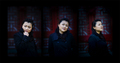
| 05/07/2007 12:21:55 PM | Threeby btrinhComment by Melethia: Greetings from the Critique Club!
Initial reaction: The thing that struck me about this when voting was how nicely it was presented - I quite like the darkness, and how that really features the model's face and her expressions. I like soft blue and red in the background, too. Nicely subtle.
Technicals: I suspect some may have found it too dark, but as I said, I like it that way.
Meets the challenge: Yep, and I particularly like the very subtle, almost imperceptible divisions between the exposures.
By the way, I don't mind the looking out of the frame in the third exposure - that works for me. |
| 05/05/2007 05:44:55 PM | |
| 05/05/2007 12:07:30 PM | |
|
Showing 201 - 210 of ~229 |
Home -
Challenges -
Community -
League -
Photos -
Cameras -
Lenses -
Learn -
Help -
Terms of Use -
Privacy -
Top ^
DPChallenge, and website content and design, Copyright © 2001-2026 Challenging Technologies, LLC.
All digital photo copyrights belong to the photographers and may not be used without permission.
Current Server Time: 04/02/2026 10:42:05 AM EDT.
|