DPChallenge: A Digital Photography Contest You are not logged in. (log in or register
 
Browse Settings
Currently viewing:
Memberfrisca

Show comments:

Per page:

Order:

Comments:


Comments Received by frisca
Pages:   ... ...
Showing 261 - 270 of ~394
Image Comment
Library Square
05/27/2003 12:32:43 PM
Library Square
by frisca

Comment by wewillexplore:
Nice toning here. I like the structure and the reflection in the left side.
Photographer found comment helpful.
Library Square
05/27/2003 08:11:33 AM
Library Square
by frisca

Comment by crabappl3:
Buildings always provide great lines and details. I like the old world vs. new world feel in this shot. The gradient of light at the top to the dark at the bottom create a nice compliment to each other. And to put the perspective on the shot you have the people at the bottom adding a nice focal point and detail. Nice work. 8 -danny
Photographer found comment helpful.
Library Square
05/26/2003 10:38:11 PM
Library Square
by frisca

Comment by goodtempo:
interesting lines but i wonder what they are leading my eyes to, my eyes wander across the image and don't find a resting place.
Photographer found comment helpful.
Library Square
05/26/2003 04:36:16 PM
Library Square
by frisca

Comment by Jacko:
Very interesting lines and angles. I really like the colors you used. Jacko.
Photographer found comment helpful.
Library Square
05/26/2003 09:41:06 AM
Library Square
by frisca

Comment by Toddh:
nice shot, I like the tones in this..... I might have cropped the people out..... good luck, Todd.
Photographer found comment helpful.
Come Together
05/26/2003 01:54:18 AM
Come Together
by frisca

Comment by HBunch:
*Critique Club*
You recieved some really interesting comments for this.
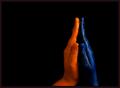
First off, the right hand (our left) looks orange to me, not red. So I think their moniter must be off. I am mentioning this, just so you know it's not YOUR moniter that's off. lol
The color is definately good. I think that both the orange and blue stand out very nicely. The background helps with this. Although the blue is dark, and the background is dark, I think that the shinyness of the blue hand is what helps it to stand out and not blend in too much with the background. There is nothing distracting in the background, however, there is a small light colored speck to the left of the crease in the wrist of the right hand (our left). If I adjust the brightness up, I can see it better than when it's darker.
I do like the angle and framing/cropping. I like that it's off center, and I think that makes it a little more dramatic and visually interesting. MY opinion though is that I wish that the hands were more symetrical. Some like symetry, some don't. I saw one comment saying they were glad they weren't symetrical. It's just a personal preference thing. I think that I'd like to see it with the orange hand being straight down like the blue hand.
I think it's the simplicity of the shot that I like, and having the hands the same would simplify it even more, to my liking.
Focus and clarity are good as well. I like that we can see the creases in the knuckles and texture of the hands. Great detail.
A really nice shot. Very deserving of the great score. Congrats!
~Heather~
Photographer found comment helpful.
Come Together
05/26/2003 12:07:46 AM
Come Together
by frisca

Comment by wewillexplore:
nice finish.
Photographer found comment helpful.
Come Together
05/25/2003 08:11:37 PM
Come Together
by frisca

Comment by wewillexplore:
Easily my favorite shot of the challenge. The blues are extremely blue, the orange is golden and the shadows don't distract, with the small exception of the inside of the blue hand - which would have been hard to help without overexposing the oranges. I love the composition - they really are "coming together." 10.
Photographer found comment helpful.
Come Together
05/24/2003 11:25:44 PM
Come Together
by frisca

Comment by dsidwell:
Nice idea! Composition is simple and effective.
Photographer found comment helpful.
Come Together
05/24/2003 04:33:17 AM
Come Together
by frisca

Comment by carsten:
One of my favourites this week. Good composition and the colors are perfect. So is focus and the cropping. I like the colors this dark. Meets the challenge very well. Well done and good luck!
Photographer found comment helpful.
Pages:   ... ...
Showing 261 - 270 of ~394


Home - Challenges - Community - League - Photos - Cameras - Lenses - Learn - Help - Terms of Use - Privacy - Top ^
DPChallenge, and website content and design, Copyright © 2001-2025 Challenging Technologies, LLC.
All digital photo copyrights belong to the photographers and may not be used without permission.
Current Server Time: 09/06/2025 10:31:28 PM EDT.