| Image |
Comment |
| 06/17/2003 04:21:04 PM |
|
 Photographer found comment helpful. Photographer found comment helpful. |
| 06/17/2003 10:48:33 AM |
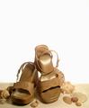
Flare (Canada's Fashion Magazine)by friscaComment by Kavey: Nice composition, good use of white space and love the use of all similar colour objects. Lighting a little harsh on one sandal and shadowed on other. Could do with just a touch more space below toe at left of image - more sand. Even with magazine title and other text this would still retain that negative space feel. 8 |
| Photographer found comment helpful. |
| 06/16/2003 05:33:34 PM |
|
| Photographer found comment helpful. |
| 06/16/2003 01:01:30 PM |
|
| Photographer found comment helpful. |
| 06/16/2003 12:04:36 PM |
|
| Photographer found comment helpful. |
| 06/16/2003 10:03:25 AM |
Flare (Canada's Fashion Magazine)by friscaComment by RiderGal: I like this a lot... I love your use of negative space... I think it really works well. The transition from the sandy look on the bottom to the white is also very nice. Why did you choose to use shells in this photo? I don't think that these are the kind of sandals you would wear the the beach are they? I guess it's kind of a very interesting statement about how far people will go for fashion Ex. wearing these sandals to the beach. Your lighting is somewhat bothersome on the higher sandal... but not horrible, more bothersome is the dirt or whatever on the other sandal, though I suppose if they used this for a magazine cover people wouldn't be so anal about using some sort of cleaning up tool. Anyway.. I think this is kinda neat, I like the overall effect. |
| Photographer found comment helpful. |
| 06/16/2003 07:53:16 AM |
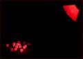
Dyslexiaby friscaComment by Mitonski: I think the thing that puts me off this picture is the complete lack of structure from the lamp... IMHO I think it would look quite good with some soft light to shot the stem and base of the lamp so that it wasn't so disembodied. The shadow from the dice looks good. Mitonski |
| Photographer found comment helpful. |
| 06/16/2003 04:33:31 AM |
Dyslexiaby friscaComment by JPR: cool idea. great red lighting, not sure how you got the spotlight so tight. This really hits the mark for marketablilty. I could see putting this on my wall. Great job. I think this is ribbon material. 10 |
| Photographer found comment helpful. |
| 06/16/2003 12:15:03 AM |
Dyslexiaby friscaComment by DavidLevin: well done but in my opinion it would look better had the light been cropped out, good though. 7 |
| Photographer found comment helpful. |
| 06/14/2003 03:54:27 PM |
|
| Photographer found comment helpful. |
Home -
Challenges -
Community -
League -
Photos -
Cameras -
Lenses -
Learn -
Help -
Terms of Use -
Privacy -
Top ^
DPChallenge, and website content and design, Copyright © 2001-2026 Challenging Technologies, LLC.
All digital photo copyrights belong to the photographers and may not be used without permission.
Current Server Time: 07/21/2026 08:03:30 PM EDT.