| Image |
Comment |
| 06/23/2003 08:29:51 AM |
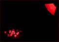
Dyslexiaby friscaComment by jodiecoston: I found this to be an extremely interesting photo and was one of the ones who gave this a 9. I think that it didn't score a 6 or higher because it's a shot that belongs in an art show in a gallery or museum - one that the viewer needs to study and appreciate. Extremely clever. Perhaps too clever for the casual voter who looks for a second and a half before voting and bases everything on a "wow" factor.
Regardless, be proud of this shot. It's a winner in my book! |
 Photographer found comment helpful. Photographer found comment helpful. |
| 06/23/2003 02:39:02 AM |
Dyslexiaby friscaComment by frisca: Thanks Jason! I'm not sure why this didn't hit a 6. I thought it was a pretty neat image. I called it "dyslexia" because I know words can seem like a big jumble of letters for someone with dylexia. :) Thanks for all the good comments, and thanks for adding it to your favourites, Jason. ;) |
| 06/23/2003 01:03:54 AM |
Dyslexiaby friscaComment by JPR: Woaah! Not even a 6? I beat this? What!? This was my second favorite for the whole challenge. I'm adding it to my favorites. Hope that makes you feel better! |
| Photographer found comment helpful. |
| 06/22/2003 08:41:26 PM |
Dyslexiaby friscaComment by wewillexplore: One of the most off center shots in the challenge. I like the cubes outside the area of light - and that the light beams across the center from corner to corner. Awesome shot. 10 |
| Photographer found comment helpful. |
| 06/21/2003 07:24:42 PM |
Memoryby friscaComment by carolee: I think this needs to be cropped either a lot closer or a lot farther. Right now it's at a midpoint that doesn't work really well for me. |
| Photographer found comment helpful. |
| 06/21/2003 12:58:14 PM |
Memoryby friscaComment by albright1: Awesome lighting, and your hair frames your face really well. Nice work! |
| Photographer found comment helpful. |
| 06/21/2003 11:54:40 AM |
|
| Photographer found comment helpful. |
| 06/21/2003 09:11:32 AM |
Memoryby friscaComment by pinback: Good try, but looks a little posed. The highlights are a little harshtoo. Nice tone though. |
| Photographer found comment helpful. |
| 06/21/2003 09:11:22 AM |
Dyslexiaby friscaComment by adine: Novel idea - compellingly executed. Red is a good color choice - makes you feel the frustration at the indeciferable (ouch! my spelling!) jumble of letters. The blackness works with this too. |
| Photographer found comment helpful. |
| 06/20/2003 10:57:48 PM |
Memoryby friscaComment by mrhbur: love the shot... however i think a natural light would have been more flattering rather then a harsh spot light |
| Photographer found comment helpful. |
Home -
Challenges -
Community -
League -
Photos -
Cameras -
Lenses -
Learn -
Help -
Terms of Use -
Privacy -
Top ^
DPChallenge, and website content and design, Copyright © 2001-2026 Challenging Technologies, LLC.
All digital photo copyrights belong to the photographers and may not be used without permission.
Current Server Time: 04/26/2026 05:15:14 AM EDT.