| Image |
Comment |
| 08/30/2010 12:37:00 PM |
|
 Photographer found comment helpful. Photographer found comment helpful. |
| 08/30/2010 08:52:14 AM |
Oops!by hojop25Comment by Lockke: I can't imagine how many times you must have tried to get this right. Extra point just for the balls to try it. |
| Photographer found comment helpful. |
| 08/28/2010 07:41:55 AM |
|
| Photographer found comment helpful. |
| 08/26/2010 12:04:08 PM |
Oops!by hojop25Comment by ThingFish: I think this is very nicely executed. Good clarity and nice tones of yellow. Sharp detail. I like the way the water drops into the glass and how it stands out against the background. The composition is also good and fits nicely into the elongated portrait frame. I was in 2 minds about whether it would have been even better to have the entire wineglass, stem and all in the frame but I realized that the image would then have been smaller and the nice close-up detail would have been lost. So I think this is just perfect and it's a very good effort. I give it a 6. |
| Photographer found comment helpful. |
| 08/26/2010 01:55:36 AM |
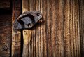
Latchby hojop25Comment by cyparis: great shot, I like the way the rusty colors melt with the wood texture |
| Photographer found comment helpful. |
| 08/25/2010 01:04:58 PM |
Oops!by hojop25Comment by bobdaveant: I gave this photo a '7'. I like the composition and the uniqueness of the image. It just doesnt scream "Yellow" to me, it more tan, or light green/brown in color. If it had been more yellow - I would have rated it higher. |
| Photographer found comment helpful. |
| 08/25/2010 11:40:23 AM |
Oops!by hojop25Comment by BeckyT: This can't possibly be doing that bad. It is yellow on my monitor so it meets the challenge. It looks like you could have taken some green out of the yellow a bit. It could be that people are not attracted to it it because of the green tinge to the yellow. At least that is the way it looks on my monitor. When I first saw it IreneM came to mind which is a good thing. I like the composition. It flows from left to right with a nice S curve. Some people get critical when a subject is coming right from the corner. For example your water (top left) is coming into the frame right from the corner. If possible crop it so it didn't come in the frame from the extreme corner. If that makes any sense. I don't think it should have hurt it that much. Focus seems pretty good to me. Well that is my 2 cents. Hopefully it was helpful. Good Luck in the challege. |
| Photographer found comment helpful. |
| 08/25/2010 11:35:51 AM |
Oops!by hojop25Comment by JustCaree: The image is a tad soft. which makes the glass and water appear to be less than crisp. The glass has a large white spot which makes it appear blown out... there are several people who do glasses and do them spectacular so DPC is used to seeing these and anything less tends to get voted down. |
| Photographer found comment helpful. |
| 08/24/2010 10:41:51 PM |
|
| Photographer found comment helpful. |
| 08/23/2010 10:55:06 PM |
|
| Photographer found comment helpful. |
Home -
Challenges -
Community -
League -
Photos -
Cameras -
Lenses -
Learn -
Help -
Terms of Use -
Privacy -
Top ^
DPChallenge, and website content and design, Copyright © 2001-2026 Challenging Technologies, LLC.
All digital photo copyrights belong to the photographers and may not be used without permission.
Current Server Time: 05/07/2026 02:07:52 AM EDT.