| Image |
Comment |
| 05/26/2003 10:32:13 PM |
|
 Photographer found comment helpful. Photographer found comment helpful. |
| 05/26/2003 09:23:54 PM |
Whirlby adineComment by boyte1: very, very nice, and simple. Great lighting and focus.9 |
| Photographer found comment helpful. |
| 05/26/2003 08:32:48 AM |
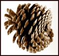
Whirlby adineComment by Toddh: Interesting image.... the detail in the pine cone is quite interesting.... I find the white background a little stark though.... I might have cropped tighter and not had the entire shape in the frame.... just my 2 cents worth... good luck, Todd. |
| Photographer found comment helpful. |
| 05/26/2003 02:48:56 AM |
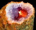
Secondary Stoneby adineComment by HBunch: *Critique Club*
Nice colors! Definately fits the challenge, and I like this because it's naturally occuring.
The black background is great. Nothing distracting there. The angle and framing/cropping is good. I wonder if you could have had this at more of an angle, but probably not. Then you wouldn't be able to see down into the rock, where it's important. Just talking outloud here. lol
No freaky blue grass this time I see. *wink*
Seriously though, I think that the focus is a bit soft, but I'm also thinking that this could simply be because of the textures of the rock. The hardest thing for me to photograph is textures and they always come out looking soft no matter what I do. I'm not really sure how to fix it either. Maybe a side light would give it some depth on the top, create a bit of shadow, and increase the "height" of the inner texture? Then again, It might hinder the lighting that makes the inside so great. *again, just talking outloud*
I tried this with a tighter crop, and I think I like it that way. Up close and personal. Probably even be able to cut off most of the black background. Both ways look good. Maybe for the challenge though, a tighter crop would bring our eyes directly to the innermost part, where the 'important' colors are.
Love the lighting to bring out the orange. I think that's the best part in my opinion. You did a great job making that stand out.
~Heather~ |
| Photographer found comment helpful. |
| 05/24/2003 11:31:45 PM |
|
| Photographer found comment helpful. |
| 05/24/2003 10:17:15 PM |
Metalic Auroraby adineComment by BJ: Honestly - have no idea what I am looking at, but know I like it!. Great job - makes you want to keep looking at it. Love the composition and cropping, and think it looks great without a border. Hope you do very well in the challenge:) |
| Photographer found comment helpful. |
| 05/23/2003 04:46:10 AM |
Boundby adineComment by brentg3: Pity about the glare, very effective anyway.. Great pic |
| Photographer found comment helpful. |
| 05/22/2003 04:59:31 PM |
Metalic Auroraby adineComment by karmat: I normally don't like abstract shots, but this one is interesting. I think it is the deep colors that I like. |
| Photographer found comment helpful. |
| 05/22/2003 02:17:48 PM |
Metalic Auroraby adineComment by qachyk: Okay, this is just plain cool. I know, that's not a terribly useful comment, but it is my reaction. I like the way that the outer top to inner center edges flow light to dark in equivalent contrast levels, very nice emphasis (whether intentional or not). |
| Photographer found comment helpful. |
| 05/22/2003 01:44:17 AM |
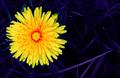
Dandy Primaryby adineComment by HBunch: *Critique Club*
I already wrote some words on this, so I'll try to elaborate on what I said previously in my comments.
I said that I do like the angle and framing/cropping. The from the top angle gives us a nice look down into the flower, and lets us see the red really well. That is important for the purpose of the challenge in my opinion. I like the negative space to the right, and think that that aspect really adds to the shot.
Your focus and clarity are good. The blades of the grass and the petals on the flower have nice sharp, crisp edges. The red areas in the middle appear a bit soft, but I think that's probably only due to their very tiny size.
The blue grass still creeps me out. I'm wondering why there are still some traces of green in areas of the grass. To the left of the flower for example? This seems strange. Well, not quite as strange as blue grass in the first place. lol The one blade that is giving off the hint of purple is a bit distracting, as it is a different color than the rest, and it is such a strong line through the photo.
The grass does help the flower to really jump out though. The dark color of the grass background really lets the bright yellow scream.
~Heather~ |
| Photographer found comment helpful. |
Home -
Challenges -
Community -
League -
Photos -
Cameras -
Lenses -
Learn -
Help -
Terms of Use -
Privacy -
Top ^
DPChallenge, and website content and design, Copyright © 2001-2026 Challenging Technologies, LLC.
All digital photo copyrights belong to the photographers and may not be used without permission.
Current Server Time: 07/17/2026 12:16:28 AM EDT.