| Image |
Comment |
| 04/25/2007 12:10:19 AM |
|
| 04/16/2007 08:43:52 PM |
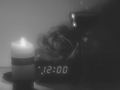
Midnightby kriscros16Comment by GoddessBePhotos: You tried something different but something just does not seem right about this picture and i can put my foot on it. |
| 04/15/2007 10:41:36 AM |
Midnightby kriscros16Comment by LuDeLush: i think for me there is to much grain...maybe to high of an ISO...i ran into the same prob. with my photo. And the midtones are to grayed out..it needs some more contrast between the pure whites and pure blacks |
 Photographer found comment helpful. Photographer found comment helpful. |
| 04/14/2007 07:41:03 PM |
|
| 04/13/2007 05:55:01 PM |
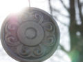
The Medallionby kriscros16Comment by kawesttex: I'll reiterate the obvious focus problem. I think it would have also helped if you had the full medalion within the frame. The attempt at the depth of field is good, the tree does not detract from the picture, but helps fill the frame. Hiding the sun a little more behind the medalion would have given more contrast and vision. Really not that far off from a great picture. |
| Photographer found comment helpful. |
| 04/13/2007 12:38:00 AM |
Midnightby kriscros16Comment by adeldegan: The image is blurred and grainy. I would rather see the colors of the wine and the flower, than the B&W. |
| Photographer found comment helpful. |
| 04/13/2007 12:13:28 AM |
Midnightby kriscros16Comment by essie: Looks kinda cloudy and out of focus, but I like the idea. Maybe try it in color next time (perhaps with a little desaturation in some areas)? |
| Photographer found comment helpful. |
| 04/12/2007 09:19:53 PM |
|
| 04/12/2007 06:39:11 PM |
Midnightby kriscros16Comment by indridistefans: Sorry I don't like it. It seems soft and the crop is a bit tight also there is some fuzzyness about it which I don't care for. |
| 04/12/2007 01:46:32 PM |
|
Home -
Challenges -
Community -
League -
Photos -
Cameras -
Lenses -
Learn -
Help -
Terms of Use -
Privacy -
Top ^
DPChallenge, and website content and design, Copyright © 2001-2026 Challenging Technologies, LLC.
All digital photo copyrights belong to the photographers and may not be used without permission.
Current Server Time: 07/15/2026 11:01:24 PM EDT.