| Image |
Comment |
| 05/18/2007 07:09:38 PM |
Day 16 - Shadowby meneleComment by Charlene: I really like all the images you've posted, but I hate saying, "Great! Beautiful! Nicely done!" on all the images. But really, I like how you do your images and conversions. They're all very interesting. And you're so consistent! I have a NOT to learn :) |
 Photographer found comment helpful. Photographer found comment helpful. |
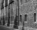
| 05/17/2007 07:52:19 PM |
Day 15 - Wallby meneleComment by sherpet: This has a cool perspective. with great leading lines, and rich tones and textures highlighted with the shadows..... |
| Photographer found comment helpful. |
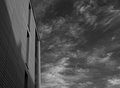
| 05/17/2007 07:50:23 PM |
Day 18 - Modernby meneleComment by sherpet: I like the angle of how you have taken this and also the composition. The sky is quite dramatic here, and it balances the differant tones and texturs of the building..... |
| Photographer found comment helpful. |
| 05/17/2007 07:46:15 PM |
Day 15 - Wallby meneleComment by alexjack: I really like the repeating shadows, repeating windows, and the nice curve to set it off, great processing.. really nice job.
Jack |
| Photographer found comment helpful. |
| 05/17/2007 07:44:51 PM |
Day 18 - Modernby meneleComment by alexjack: The sky is great - you're right, and you'v done a fantastic job in procesing it. I like the implied dynamic diagonal lines all leading from the ur corner to the lower L corner. The building unfortunately tends to go against that with an opposite flow and so it doesn't quite work for me.
Jack |
| Photographer found comment helpful. |
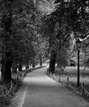
| 05/17/2007 07:39:51 PM |
Day 17 - Pathby meneleComment by alexjack: Nice shot, I really like the areas of alternating bright and dark along the path, both the lamp and the bright area in the trees tend to draw me away though. The may have been a bit more drama to have the path start in the corner too.
Jack |
| Photographer found comment helpful. |
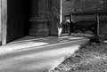
| 05/17/2007 07:37:26 PM |
Day 16 - Shadowby meneleComment by alexjack: I like the idea, but it gets lost in the whole picture with a fairly bright foreground, areas of high contrast ( the wall and the door).
I'd look for a pov that helps to separate the shadow from these areas.
Jack |
| Photographer found comment helpful. |
| 05/17/2007 05:33:55 PM |
drugs.porn.liquor.by meneleComment by citymars: I had to go on the internet to find out what I thought "Rizla" was a label on one of the videotapes -- I had to go on the internet to find out what it means. :-) |
| Photographer found comment helpful. |
| 05/17/2007 03:09:52 PM |
|
| Photographer found comment helpful. |
| 05/16/2007 07:25:18 PM |
drugs.porn.liquor.by meneleComment by Tygerr: Funny depiction. The lighting is not spot on - too many shadows floating around. Maybe you could have double diffused the light, or used a larger light source? I like the processing though. |
| Photographer found comment helpful. |
Home -
Challenges -
Community -
League -
Photos -
Cameras -
Lenses -
Learn -
Help -
Terms of Use -
Privacy -
Top ^
DPChallenge, and website content and design, Copyright © 2001-2026 Challenging Technologies, LLC.
All digital photo copyrights belong to the photographers and may not be used without permission.
Current Server Time: 06/21/2026 02:58:48 PM EDT.