| Image |
Comment |
| 06/04/2003 03:14:21 PM |
|
 Photographer found comment helpful. Photographer found comment helpful. |
| 06/03/2003 11:39:06 PM |
|
| Photographer found comment helpful. |
| 06/03/2003 03:05:23 PM |
|
| Photographer found comment helpful. |
| 06/02/2003 08:17:28 PM |
Sound of Musicby sherryk471Comment by qachyk: The slight angle and the bright lighting help make this an interesting shot even though the topic is obviously not totally original. The position of fingers helps with the active 'sound' presentation, too. Kinda looks like my Casio (hey, give that back!). |
| Photographer found comment helpful. |
| 06/02/2003 05:07:28 PM |
|
| Photographer found comment helpful. |
| 06/02/2003 01:23:30 PM |
|
| Photographer found comment helpful. |
| 06/02/2003 12:26:55 AM |
Sound of Musicby sherryk471Comment by RiderGal: This would have been more effective if you slowed the shutter speed, and got the persons hands really moving along the keyboard of the piano... it would have been nice to see some action and show the person really playing rather than just resting a hand there... |
| Photographer found comment helpful. |
| 06/01/2003 12:37:47 AM |
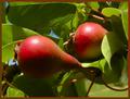
Natural Red and Green (baby pears)by sherryk471Comment by inspzil: Greetings from the Critique Club
By Inspzil
Composition - 2 small pears in a tree. I can't say I've paid too much attention to baby pears before. Around here we seem to have more green ones than red. The framing of this shot is pretty good. I think if the pears were not as close on the vertical plane it would've strengthened the shot by taking out a little of the green and making the part we viewers focus on a little broader. Usually I find myself saying the opposite, but each pic is different. The photo has a nice balance to it. The colors if they were a little more equally distributed would contribute to that. The green is a little overpowering.
Technical - This needs to be focused better, and that's the bottom line. The rest of the pic would've scored reasonably well but it's just not as focused (or focused in the right spots) as I think it should've been. The exposure is pretty good and as a result, that helps the color of this photo.
Overall - A pair of predictable complimetary colors. This just wasn't executed to maximize the potential of the subject. I think the composition is adequate, but not outstanding. Maybe it would've been a little better to alter the angle a little to achieve a more unique perspective on these 2. I think that would help a lot the more I think about it. Hope this could be of some use to you. Good luck and keep shooting - Bob |
| 05/31/2003 09:26:13 PM |
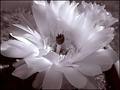
Catus Flowerby sherryk471Comment by LindaLee: I am not normally a big fan of flowers done in b&w, but this is lovely. I like your choice of duotoning, and also the composition. The dark area at the center of the flower seems to balance it well. I love the very feathery aspect of the flower, which lends itself well to this treatment. The lighting is probably the thing that really makes this shot for me, since it has produced a fairly good range of tone. Very nice. |
| Photographer found comment helpful. |
| 05/31/2003 12:28:25 PM |
|
| Photographer found comment helpful. |
Home -
Challenges -
Community -
League -
Photos -
Cameras -
Lenses -
Learn -
Help -
Terms of Use -
Privacy -
Top ^
DPChallenge, and website content and design, Copyright © 2001-2026 Challenging Technologies, LLC.
All digital photo copyrights belong to the photographers and may not be used without permission.
Current Server Time: 07/15/2026 02:44:39 PM EDT.