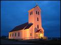
DPChallenge: A Digital Photography Contest You are not logged in. (log in or register
 
Browse Settings
Currently viewing:
Registered Usertyrkinn

Show comments:

Per page:

Order:

Comments:


Comments Received by tyrkinn
Pages:   ... [51] [52] [53] [54] [55] [56] ... [67]
Showing 521 - 530 of ~666
Image Comment
The hot seat
07/14/2003 02:41:05 PM
The hot seat
by tyrkinn

Comment by karmat:
Definitely added interest to what would havebeen just another stovetop shot. Hoe you didn't make the house stink or anything. :-)
Photographer found comment helpful.
Midnight Church (color)
07/10/2003 11:47:04 AM
Midnight Church (color)
by tyrkinn

Comment by tyrkinn:
This is my duotone submission, before I turned it to b/w. I like it better in full color, but the challenge was duotone, so i did. The subject is a church in Iceland, in Ãlftanes, called Garðakirkja.
Neo2.jpg
07/10/2003 11:44:53 AM
Neo2.jpg
by tyrkinn

Comment by tyrkinn:
This is a outtake from the Matrix challenge.
Home Wall
06/10/2003 01:32:06 AM
Home Wall
by tyrkinn

Comment by OneSweetSin:
*Critique Club*

The color and contrast of the painting and wall are good. Your focus appears to be pretty good too.

You have two problems with the entire image. First being the lighting glare, it left a big white spot that distracts from the painting itself. Secondly the big emptiness of the image There is nothing in the bottom half to look at. A floral arrangement on a table or a chair added to the left side of the image would have added something to it and balanced it out somewhat so you would be looking at something on the bottom instead of emptiness.

It does say Home to me so with that in mind it meets the challenge.

Anna
Photographer found comment helpful.
Midnight Church
06/06/2003 01:50:39 AM
Midnight Church
by tyrkinn

Comment by HBunch:
*Critique Club*
Wow...the focus and clarity here are supurb. The lines are so crisp and clean that this almost looks like a model. The building is so flat, and most of all so CLEAN. Look at how white that building is!
I'm not a religous person, but I reallyl ove the way the cross on top stands out so perfectly. Like it's glowing or something.
They really have this church lit well. And I think you took advantage of that nicely.
The angle and framing/cropping are good in my opinion. I like how you have placed a little space in front of the church for 'breathing room' I think it's very effective. I am wondering though, is there a bit of wide angle lens distortion? I say this because if I line up the vertivals with the edge of my screen, the ones on the left of the screen appear to be leaning to the right and the vertivals on the right seem to be leaning a bit to the left. Everything is leaning inward. There really isn't a true vertical in the shot that I could find. Mind you, this is only a obsessive compulsive distraction, and doesn't seem to effect the photo in a bad way, rather just an irratation to me, who actually sits and lines these things up. lol
I like the tonal range (is that the 'proper' term?) I see nice white whites, and nice black blacks. The sky is beautiful, and nice for this image.
What makes a photo 'icelandic'? I see this was taken in Iceland, but what was the giveaway? Is there a certain style or something that is considered Icelandic?
A really nice photo. Great job.
~Heather~
Photographer found comment helpful.
Home Wall
06/03/2003 02:05:39 PM
Home Wall
by tyrkinn

Comment by skief:
Interesting, although a bit too much glare
Photographer found comment helpful.
Home Wall
06/03/2003 04:43:06 AM
Home Wall
by tyrkinn

Comment by gemslinn:
very interesting...I like it.
Photographer found comment helpful.
Midnight Church
06/03/2003 04:19:43 AM
Midnight Church
by tyrkinn

Comment by Binni:
Flott mynd ..Two thums up..
Photographer found comment helpful.
Home Wall
06/03/2003 02:39:56 AM
Home Wall
by tyrkinn

Comment by frisca:
interesting shot, though I think that large light glaring off the wall is distracting.
Photographer found comment helpful.
Dodge this!
06/02/2003 11:01:24 PM
Dodge this!
by tyrkinn

Comment by kosmikkreeper:
Geetings from the CC!

1st off, this was one of my top 5 for this challenge! Great job. It's so hard giving condtructive feedback on a pic you love but I'll try!

COLOR & FOCUS: Color is good, maybe a little more on the green side woul've given it a more Matrixy feel to it. Focus... great! How the heck did you manage to focus down the barrel? You must have been on manual focus.:)

THEME: Respected.

COMPOSITION: Impecable! An original idea and that always scores high with me! The only little minor thing would be the piece of cloth that I see on the right. Too bad we can't do some spot editing for anoyances like that!

Photos like your really inspire! Keep it up!!

Yanik
Photographer found comment helpful.
Pages:   ... [51] [52] [53] [54] [55] [56] ... [67]
Showing 521 - 530 of ~666


Home - Challenges - Community - League - Photos - Cameras - Lenses - Learn - Help - Terms of Use - Privacy - Top ^
DPChallenge, and website content and design, Copyright © 2001-2025 Challenging Technologies, LLC.
All digital photo copyrights belong to the photographers and may not be used without permission.
Current Server Time: 08/23/2025 10:04:51 AM EDT.