| Image |
Comment |
| 07/27/2004 03:39:04 PM |
|
 Photographer found comment helpful. Photographer found comment helpful. |
| 07/26/2004 07:34:18 AM |
|
| Photographer found comment helpful. |
| 07/02/2004 12:27:05 PM |
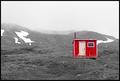
Emergency Shelterby tyrkinnComment by Neuferland: Greetings from the Critique Club!
Reading over the comments you already received, there's not a lot I can add to them. I too liked this during the challenge and gave it a 7 but the lack of contrast in the landscape compared to the cabim made the shot seem a bit off balance to me. Also the pink door was also a bit distracting especially since the window frame and rest of the trim seemed more white. It's a great shot and with a little more processing of the landscape it could be a fantastic shot!
Good Luck In Future Challenges!
Deannda
DNeufer@stny.rr.com if you have any questions or want to discuss this further! |
| Photographer found comment helpful. |
| 06/27/2004 10:28:19 PM |
|
| Photographer found comment helpful. |
| 06/27/2004 06:17:22 PM |
Emergency Shelterby tyrkinnComment by Imagineer: The bleak landscape gives this shot more interest than most, questioning why red is chosen to paint this structure (provided you haven't changed it from green/blue?). The title obviously gives all away, but if this were seen outside of the challenge I like to guess its relevance. Good composition. Saturation of colour is a bit rich compared to mono areas. |
| Photographer found comment helpful. |
| 06/25/2004 06:18:57 PM |
Emergency Shelterby tyrkinnComment by Glacierwolf: Taken on a better day with more contrast in the grass and background this shot may have worked gang busters. But the haze/fog in the background signifies tones of grey belong in the picuture ....... it nulifies allof of the shock of missing colors. |
| Photographer found comment helpful. |
| 06/25/2004 08:25:22 AM |
|
| Photographer found comment helpful. |
| 06/24/2004 02:18:13 PM |
Emergency Shelterby tyrkinnComment by melismatica: I like the approach and the scene. The foreground looks a bit murky and out of focus. Perhaps adjusting the contrast a bit first and than doing the desaturation technique may have brightened it a bit. As it is, the b&w appears very dull with almost no darks. |
| Photographer found comment helpful. |
| 06/24/2004 11:29:47 AM |
Emergency Shelterby tyrkinnComment by Lafaminit: this is an effective photo...the touches of snow, the fog, etc with the starkness of the shack really look great together. |
| Photographer found comment helpful. |
| 06/24/2004 09:11:33 AM |
Emergency Shelterby tyrkinnComment by redmoon: the brightness or contrast (one of those things) of the hut seems out of synch with the rest. perhaps if the land around the hut was made darker it would seem more at one (or do you have PS? try selecting the land and play with curves by doing left end down and right end up). it's a pity because i feel the composition, subject matter and the environment is all totally brilliant, and this is one of the most can-hang-on-a-wall shots submitted this week. Selective desat is totally suitable here. 8. |
| Photographer found comment helpful. |
Home -
Challenges -
Community -
League -
Photos -
Cameras -
Lenses -
Learn -
Help -
Terms of Use -
Privacy -
Top ^
DPChallenge, and website content and design, Copyright © 2001-2026 Challenging Technologies, LLC.
All digital photo copyrights belong to the photographers and may not be used without permission.
Current Server Time: 07/16/2026 04:54:34 PM EDT.