| Image |
Comment |
| 05/19/2007 01:28:28 AM |
mary janeby simplesilentComment by liou: Originally posted by lkn4truth:
CRITIQUE CLUB COMMENT
I really like this shot on first impressions. I think your lighting is very good here...nearly perfect with the possible exception being a bit too dark on the right eye - but that's really nit picking. I love the shadows captured on the face...quite excellent. I'm not sure how I feel about the long flowing curtains. Something seems off about them. For the most part I like them but as I'm trying to imagine what is going on in the photo I'm left at a bit of a loss at first. After really studying the photo it appears to me that what she is doing is looking out of the curtain to something below on the street (I imagine she's up a floor or too looking down). In retrospect, all of this is excellent because your photo indeed tells a story when I can imagine she's looking at something out the window from a second story window and I'm curious what it is. Unfortunately you have about 2 seconds for the average voter to "get it" and I don't think it is obvious enough at first glance that she is looking out the opened curtain. Doing something to enhance that part would really help. Perhaps open the curtain up a bit more and have more light coming in from that spot directly, lighting up that side of the face. As I'm trying to find something to explain why this shot didn't score better I'm really coming up with a loss here. I really think it's a strong photo. Perhaps the curtains are too wrinkled? Perhaps the model's hair is a tad mussy and out of place which causes a slight distraction. See...nitpicking again. Honestly, I can't explain it. I can tell the photo isn't a top 10 contender but I can't put my finger on it. Sorry about that. Take pride in the fact that you got zero 1's or 2's in voting. I.E. NO ONE thought it sucked. Converserly you got 3 9's and 10's which means some people thought it was fantastic. My biggest form of criticism would simply be that it isn't the strongest photo for a Free Study challenge. As you may well be aware, Free Study encourages the best of the best to come out. You really have to do something over the top to get noticed here. Had this photo been in a weekly challenge such as "Pensive" or something you'd probably be a top 10 contender for sure! Great job, really. |
oh ,i think so ,and lkn4truth say it particular!
|
 Photographer found comment helpful. Photographer found comment helpful. |
| 05/14/2007 08:12:41 PM |
|
| Photographer found comment helpful. |
| 05/12/2007 03:53:54 PM |
mary janeby simplesilentComment by lkn4truth: CRITIQUE CLUB COMMENT
I really like this shot on first impressions. I think your lighting is very good here...nearly perfect with the possible exception being a bit too dark on the right eye - but that's really nit picking. I love the shadows captured on the face...quite excellent. I'm not sure how I feel about the long flowing curtains. Something seems off about them. For the most part I like them but as I'm trying to imagine what is going on in the photo I'm left at a bit of a loss at first. After really studying the photo it appears to me that what she is doing is looking out of the curtain to something below on the street (I imagine she's up a floor or too looking down). In retrospect, all of this is excellent because your photo indeed tells a story when I can imagine she's looking at something out the window from a second story window and I'm curious what it is. Unfortunately you have about 2 seconds for the average voter to "get it" and I don't think it is obvious enough at first glance that she is looking out the opened curtain. Doing something to enhance that part would really help. Perhaps open the curtain up a bit more and have more light coming in from that spot directly, lighting up that side of the face. As I'm trying to find something to explain why this shot didn't score better I'm really coming up with a loss here. I really think it's a strong photo. Perhaps the curtains are too wrinkled? Perhaps the model's hair is a tad mussy and out of place which causes a slight distraction. See...nitpicking again. Honestly, I can't explain it. I can tell the photo isn't a top 10 contender but I can't put my finger on it. Sorry about that. Take pride in the fact that you got zero 1's or 2's in voting. I.E. NO ONE thought it sucked. Converserly you got 3 9's and 10's which means some people thought it was fantastic. My biggest form of criticism would simply be that it isn't the strongest photo for a Free Study challenge. As you may well be aware, Free Study encourages the best of the best to come out. You really have to do something over the top to get noticed here. Had this photo been in a weekly challenge such as "Pensive" or something you'd probably be a top 10 contender for sure! Great job, really. |
| Photographer found comment helpful. |
| 05/12/2007 11:59:05 AM |
|
| Photographer found comment helpful. |
| 05/11/2007 03:48:11 AM |
|
| Photographer found comment helpful. |
| 05/11/2007 02:23:09 AM |
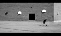
coachby simplesilentComment by Melethia: Very intriguing! I like how the two hoops on the facing wall and the door form a "face" of sorts. And I very much like both the minimalism and the moment of capture, where he's reaching for the ball. |
| Photographer found comment helpful. |
| 05/10/2007 09:38:03 PM |
horror flowerby simplesilentComment by Louis: Beautiful. An unusual composition, very vertical, intriguing. The hot right edge is an interesting counterbalance to the deep contrasts... the warm duotone is very pleasing. Your title is great, ambiguous, enigmatic, just like this image (and most of your other stuff). |
| Photographer found comment helpful. |
| 05/07/2007 10:51:49 PM |
yasgurs farmby simplesilentComment by CalliopeKel: Wow, what a thrilling portrait. Her hair and the tones are amazing. The far away look in her eyes is interesting as well. Good work. |
| Photographer found comment helpful. |
| 05/07/2007 10:09:26 PM |
|
| Photographer found comment helpful. |
| 05/07/2007 04:23:23 PM |
|
Home -
Challenges -
Community -
League -
Photos -
Cameras -
Lenses -
Learn -
Help -
Terms of Use -
Privacy -
Top ^
DPChallenge, and website content and design, Copyright © 2001-2026 Challenging Technologies, LLC.
All digital photo copyrights belong to the photographers and may not be used without permission.
Current Server Time: 07/27/2026 09:20:05 PM EDT.