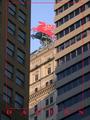
DPChallenge: A Digital Photography Contest You are not logged in. (log in or register
 
Browse Settings
Currently viewing:
Registered Usercmrk74

Show comments:

Per page:

Order:

Comments:


Comments Received by cmrk74
Pages:   ... ...
Showing 51 - 60 of ~155
Image Comment
Antique Echo
06/02/2003 03:00:29 PM
Antique Echo
by cmrk74

Comment by hawkida:
Image looks oddly warped and as with some other submissions I feel there is no sound here, only the potential for sound.
Antique Echo
06/02/2003 04:16:10 AM
Antique Echo
by cmrk74

Comment by tragicharpy:
my eye seems be drawn away from the sound of this to the bottom right due to the shine, maybe shooting this slightly lower to get more of the mouth piece in and less shine would have got you an 8 off me but due to the shine 6 - 7
Photographer found comment helpful.
Antique Echo
06/02/2003 12:21:22 AM
Antique Echo
by cmrk74

Comment by OneSweetSin:
I got one of these too, it was my Grandfathers, why didn't I think of it...lol Good representation of sound.
Photographer found comment helpful.
Cemetary in Duotone
05/28/2003 02:13:10 AM
Cemetary in Duotone
by cmrk74

Comment by Firstrich1:
almost like they are visiting...I like...thanks
Photographer found comment helpful.
Cemetary in Duotone
05/26/2003 09:20:08 AM
Cemetary in Duotone
by cmrk74

Comment by tyrkinn:
Nice angle, tilting stones look great
Photographer found comment helpful.
Primary Red Caboose
05/21/2003 10:55:43 PM
Primary Red Caboose
by cmrk74

Comment by ursula:
From the Critique Club

Hello Mark,

First impressions: Your entry to "Primary Colors" is a nice, clean shot, that meets the challenge, but might have done better if it weren't showcasing only red. Like one of your commenters below wrote, it's interesting how many shades of red one can see in this photo.

Technical aspect: No problems. Focus and lighting are very good. I like all the different colours shown in the shadows.

Composition: The perspective is very normal, which probably makes it less interesting: the caboose is shown in the picture as a person would see it when walking by. The picture fills the frame nicely, although to my eyes it looks slightly tilted to the left. My nitpick here is that there is not really a story being told, or something to hold my attention, thus, it might not be the most effective way to show the caboose.

Overall: Nice, clean picture, good colour, but lacking in excitement (the "wow" factor). By the way, I like your cactus2 picture! The greys are so soft and almost shiny! Good work.

Take care,

Ursula
Photographer found comment helpful.
Close Perimeter
05/20/2003 02:30:43 PM
Close Perimeter
by cmrk74

Comment by Chuckie:
nice job i really like the colors
Photographer found comment helpful.
Close Perimeter
05/20/2003 01:38:38 PM
Close Perimeter
by cmrk74

Comment by Becky:
The shapes in your photo creates texture.
Photographer found comment helpful.
Close Perimeter
05/19/2003 09:27:42 PM
Close Perimeter
by cmrk74

Comment by frisca:
I don't agree with your focus/DOF here. I think the lines where the cones meet are very interesting and would have benefitted from being in focus.
Photographer found comment helpful.
Mobil Pegasus
05/18/2003 07:33:36 PM
Mobil Pegasus
by cmrk74

Comment by sylandrix:
Greetings from the Critique Club!...

COMPOSITION... I'm not sure a tight composition fits a postcard challenge, as one commenter already pointed out it doesn't really show "Dallas". Unless there is a connection with the red horse, which a non-Dallasian wouldn't even know about, then this could have easily come from any other city.

Postcard challenge not withstanding, it is different than a typical skyline shot, which you'd expect lots of in this particular challenge. I like the repeated use of diagonals and verticals in the shot. The red horse billboard is the only object interfering with the pattern, and since we're bordering on abstract to begin with, you may as well have cropped out that portion altogether/shot lower and fill your entire frame with patterns of diagonals and lines. Just using my hand to crop out the top half of the photo immediately appeals to me more... Again, unless the red horse has vital significance for Dallas that I am unaware of...

TECHNIQUE...Looks like you chose a really good type of lighting and angle, To my eye, the colors look like they could be a little warmer (using a color balance adjustment, for example.) ... but this kind of evaluation is difficult when viewing photos that may look slightly different on everyone's monitor...

I remain reserved about the border choice. A frank departure from your usual border, I think this could work, only not with pure red. You could try a drop shadow like a commenter suggested, or try another shade, just slightly darker, or a paler (less saturated) version of red. i find type always looks slightly amateurish when its color is mostly composed of a primary (RGB) color..

OVERALL...Maybe not best suited for postcards, your photo is a good skyscraper abstraction. With a shot consisting solely of building patterns, you'd have a very compositionally strong photo of repeating angles and lines.
Photographer found comment helpful.
Pages:   ... ...
Showing 51 - 60 of ~155


Home - Challenges - Community - League - Photos - Cameras - Lenses - Learn - Help - Terms of Use - Privacy - Top ^
DPChallenge, and website content and design, Copyright © 2001-2025 Challenging Technologies, LLC.
All digital photo copyrights belong to the photographers and may not be used without permission.
Current Server Time: 06/18/2025 01:47:21 AM EDT.