| Image |
Comment |
| 03/18/2011 03:32:51 PM |
Goneby quasicameraComment by expatdawn: I wish the colors on the label were a bit more vibrant they seem a little muted. |
| 03/18/2011 02:35:11 PM |
|
| 03/18/2011 11:26:23 AM |
Goneby quasicameraComment by MCPixel: Would have been nicer if the lable wasnt so dark, but the overall shot has good effect. 6 |
| 03/17/2011 06:11:16 PM |
Goneby quasicameraComment by mariuca: The challenge said: "Use a water bottle in your entry" but it did not mean "do not photograph anything else". This picture does not give the viewer much other than a few droplets and since I marked it under 5 I had to say why. |
| 03/17/2011 05:40:45 PM |
Goneby quasicameraComment by LMGU83: It's a little overexposed in my opinion, you almost lost the lines that define the body of the bottle. |
| 03/16/2011 10:34:42 PM |
|
| 03/15/2011 08:02:15 AM |
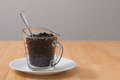
Cup of Coffeeby quasicameraComment by uskesu: Somehow all those different materials and textures annoy me. The glass measuring cup, the wood finish, the porcelain saucer, the plastered wall... And they annoy me because the picture is composed in such a way that my attention - after having eyed the strange combination of coffee in such a cup - can only go to those textures. But the textures aren't that much interesting either. So... it itches. And I think it would have been more interesting to me if you'd experimented more with lighting effects and composition. So that there's more to look at. |
| 03/11/2011 04:39:13 PM |
|
| 03/10/2011 03:44:02 PM |
|
| 03/09/2011 03:36:43 PM |
|
Home -
Challenges -
Community -
League -
Photos -
Cameras -
Lenses -
Learn -
Help -
Terms of Use -
Privacy -
Top ^
DPChallenge, and website content and design, Copyright © 2001-2026 Challenging Technologies, LLC.
All digital photo copyrights belong to the photographers and may not be used without permission.
Current Server Time: 07/02/2026 11:19:37 PM EDT.