| Image |
Comment |
| 05/06/2003 08:31:37 PM |
Divinityby magnusComment by Jacko: Good job at framing your subject. Good eye. Nice angles on the building. Jacko. 8 |
 Photographer found comment helpful. Photographer found comment helpful. |
| 05/06/2003 04:36:48 PM |
Divinityby magnusComment by sherryk471: Nicely done. At first I thought the boarder was something different but you have blended it super well and makes a very effective frame. |
| Photographer found comment helpful. |
| 05/06/2003 09:48:56 AM |
Divinityby magnusComment by kiwiness: Good idea with the natural framing. The composition is good, the text doesn't distract from the main image, and on top of all that you caught yourself a nice sunny day too. |
| Photographer found comment helpful. |
| 05/05/2003 08:12:33 PM |
Divinityby magnusComment by KarenB: Nice shot! I almost went to Harvard Square myself, then thought to do something else!!! ;0)
I like the silouette of the opening that effectively frames the school/church. Nice clear image.. and great colors. |
| Photographer found comment helpful. |
| 05/05/2003 01:43:44 PM |
Divinityby magnusComment by ursula: Beautiful layout, nice framing! I wish the church were clearer, or in better light. |
| Photographer found comment helpful. |
| 05/05/2003 12:15:36 PM |
Divinityby magnusComment by deckyon: Excellent shot. Where's the rest of the chapel. The framing is great, but is it possible to get the rest of the chapel (the left side.) |
| Photographer found comment helpful. |
| 05/05/2003 12:45:46 AM |
|
| Photographer found comment helpful. |
| 04/30/2003 10:03:19 PM |
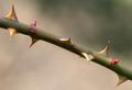
Unfriendly Floraby magnusComment by mbardeen: Greets from the Critique club:
Hi Magnus!
For this me, this picture lacks wow factor. It's certainly different than most in this challenge and I like it for that. It's also a very simple composition - branch running diagonally and blurry background. That's also good in my book. What I don't like is that the this is soft or that the focus is lacking.. I want to see sharp pointy things, not suggestions of sharp pointy things! Also the shot seems strangely colorless. That may be due to the very plain background - probably not much you can do about that though! Too nitpick, I don't really like the positioning of that one thorn in the middle, I think it's just a bit too centered. Maybe a slightly different crop would have allieveated that?
Good job and good luck!
-Matt |
| Photographer found comment helpful. |
| 04/29/2003 07:30:25 PM |
|
| Photographer found comment helpful. |
| 04/29/2003 02:09:19 PM |
|
| Photographer found comment helpful. |
Home -
Challenges -
Community -
League -
Photos -
Cameras -
Lenses -
Learn -
Help -
Terms of Use -
Privacy -
Top ^
DPChallenge, and website content and design, Copyright © 2001-2026 Challenging Technologies, LLC.
All digital photo copyrights belong to the photographers and may not be used without permission.
Current Server Time: 06/21/2026 08:44:06 AM EDT.