| Image |
Comment |
| 03/26/2004 11:00:24 PM |
|
| 03/25/2004 10:07:07 AM |
|
 Photographer found comment helpful. Photographer found comment helpful. |
| 03/25/2004 07:26:29 AM |
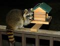
Detective Magazine - Bandit Discoveredby DrakeComment by KevinRiggs: Cute capture and potentially dangerous work on your part. A little too much flash and since this is an Advanced Editing challenge I think you could clean up the eyes a little so that you don't get the "green eye" that animals tend to produce when flashed (ummm, errr, I don't actually know what you were wearing but I meant with the camera flash). Cute capture, tho. |
| 03/23/2004 05:15:24 AM |
Detective Magazine - Bandit Discoveredby DrakeComment by cbonsall: (I'm writing this to everyone who submitted a landscape shot) The challenge was to produce a shot worthy of a magazine cover but to me a shot like this is not suitable to be put on a "portrait" format magazine.
---ADDITIONAL---
Due to forum discussions and accusations that marking landscapes down is nitpicking, I'm going through them and remarking. I still think some of the landscapes would not make good covers because of their orientation but I am no longer marking down because of that.
I still think landscape is inapropriate for the majority of magazines but I'll give the benefit of the doubt to the photographers. |
| Photographer found comment helpful. |
| 03/22/2004 03:08:41 PM |
|
| Photographer found comment helpful. |
| 03/22/2004 07:22:01 AM |
|
| Photographer found comment helpful. |
| 03/16/2004 11:09:16 PM |
|
| 03/15/2004 08:32:47 AM |
|
| 03/15/2004 12:16:12 AM |
|
| Photographer found comment helpful. |
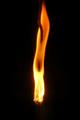
| 03/14/2004 11:23:45 PM |
Rock 'n Flameby DrakeComment by dr rick: Greetings from the Critique Club!
The message
The idea this image conveys is creative. The shape of the rock is similar to the cone of a volcano, so the flame shooting from it works well. It has a nice "wow factor".
Creative choices
The background is perfect. The composition works well, as does the vertical format. Lighting from the flame is great, but the lighting on the rock needs to be more even; a fill light on the left would avoid the distracting deep shadow. Some sharpening would bring out the texture of the rock. I also think the rock would work better if it was a reddish brown; adjusting the hue slightly would be fairly easy in most photo editing programs (and legal for this challenge).
Technical aspects
Focus is fine, though a bit soft. Exposure of the flame is great, but the rock has some hot spots. Color rendition is very nice. |
| Photographer found comment helpful. |
Home -
Challenges -
Community -
League -
Photos -
Cameras -
Lenses -
Learn -
Help -
Terms of Use -
Privacy -
Top ^
DPChallenge, and website content and design, Copyright © 2001-2026 Challenging Technologies, LLC.
All digital photo copyrights belong to the photographers and may not be used without permission.
Current Server Time: 06/26/2026 10:34:22 PM EDT.