| Image |
Comment |
| 01/16/2008 10:46:04 PM |
|
 Photographer found comment helpful. Photographer found comment helpful. |
| 01/16/2008 12:09:45 PM |
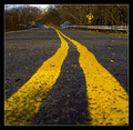
Dangermouse.by LonzComment by guako: really good idea... the shot seems so "square" ...I guess you cropped it a bit, but with this vertical subject I would have preferred a "higher" shot... and I'm asking myself if the shot wouldnt have been even better if you had excluded most of the upper part (the one that's not the street). This way there wouldnt be so many distracting details and the eye would have really been drawn right into the picture!
But as it is it's a great shot! |
| Photographer found comment helpful. |
| 01/16/2008 12:09:14 PM |
|
| Photographer found comment helpful. |
| 01/16/2008 11:17:33 AM |
Dangermouse.by LonzComment by nicholasdion: good idea for this challenge. you should have been up a bit higher so you could get the focus in the foreground though. The image has also been over sharpened so try and tone down the sharpening. Good idea though and a decent attempt. |
| Photographer found comment helpful. |
| 01/16/2008 09:52:50 AM |
|
| Photographer found comment helpful. |
| 01/16/2008 07:51:38 AM |
|
| Photographer found comment helpful. |
| 01/16/2008 12:57:57 AM |
|
| Photographer found comment helpful. |
| 01/15/2008 11:26:42 PM |
|
| Photographer found comment helpful. |
| 01/15/2008 10:12:45 PM |
|
| Photographer found comment helpful. |
| 01/15/2008 04:00:05 PM |
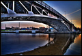
The Shotby LonzComment by kellyrc01: I really liked this shot Lonz, I love the darkening sky in the background |
| Photographer found comment helpful. |
Home -
Challenges -
Community -
League -
Photos -
Cameras -
Lenses -
Learn -
Help -
Terms of Use -
Privacy -
Top ^
DPChallenge, and website content and design, Copyright © 2001-2026 Challenging Technologies, LLC.
All digital photo copyrights belong to the photographers and may not be used without permission.
Current Server Time: 06/23/2026 10:07:53 AM EDT.