| Image |
Comment |
| 04/01/2004 04:56:49 PM |
|
| 03/25/2004 02:04:26 PM |
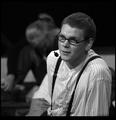
Actorby helgihelgiComment by Dibutil: I thought this would be among leaders...
Anyways, the only thing i am missing here is the light reflection in his left eye instead of which there is a light spot on the glasses frame - makes the sight look displaced a bit. |
| 03/23/2004 03:32:30 PM |
Actorby helgihelgiComment by tyrkinn: Flott mynd, vel gert. Collage þýðir reyndar háskóli, FG er ekki enn orðinn háskóli...
|
| 03/23/2004 03:18:04 PM |
|
| 03/22/2004 07:39:39 PM |
|
| 03/21/2004 05:58:51 PM |
Actorby helgihelgiComment by lizzyc3: Very cool- not a usual portrait- Great expression and I like the outfit- great job 9 |
 Photographer found comment helpful. Photographer found comment helpful. |
| 03/21/2004 12:07:37 PM |
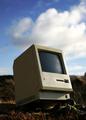
Classicby helgihelgiComment by dr rick: Greetings from the Critique Club!
The message
By putting the computer in an outdoor setting, far from any source of power and sans a keyboard and mouse, this image focuses on the physical design of this venerable device, thus creatively meeting the challenge. More subtly, the image says something about how useless the device is today--little more than a nostalgic reminder of how far computing has advanced in recent years. The dichotomy works well for me, and makes this a great photo. But it's not something you see with a quick glance, so most voters probably missed it.
Creative choices
Great composition; the photo is nicely balanced and shooting upward from a low angle gives the obsolete device an aura of dignity, as does the backwards tilt ("keeping its head up"). The photo works great in color, with the beige computer a nice contrast to the colors of the setting in which it is placed. I personally think it would have worked well as a sepia monochrome, which would give a more "antique" feel.
Technical aspects
The tonal rendition here is wonderful; some detail is lost in the darkest shadows and brightest parts of the clouds, but it doesn't have any negative impact on the image at all. |
| Photographer found comment helpful. |
| 03/21/2004 02:08:58 AM |
|
| 03/18/2004 11:26:25 AM |
Actorby helgihelgiComment by Pedro: the border looks odd being thicker at the bottom (and maybe the top, i can't tell). the pic itself is nice - a little flat (which is hard to avoid with stage lights because they're so bright). I might adjust the curves a little to highlight some facial features, and maybe a little dodge/burn around the eyes. Glasses are a pain to shoot. Composition is very nice - great pose and expression.
Pedro |
| Photographer found comment helpful. |
| 03/17/2004 06:05:07 PM |
|
Home -
Challenges -
Community -
League -
Photos -
Cameras -
Lenses -
Learn -
Help -
Terms of Use -
Privacy -
Top ^
DPChallenge, and website content and design, Copyright © 2001-2026 Challenging Technologies, LLC.
All digital photo copyrights belong to the photographers and may not be used without permission.
Current Server Time: 07/16/2026 07:10:40 AM EDT.