| Image |
Comment |
| 05/21/2007 04:29:16 PM |
Blue Skyby pla2Comment by klynn: You might have emphasized the blue sky more if you had the tree in gray. With such a large percentage of the picture in color and with tombstones that are usually gray anyway, it's kinda hard to see the desaturation. |
 Photographer found comment helpful. Photographer found comment helpful. |
| 05/21/2007 10:46:29 AM |
Blue Skyby pla2Comment by ericsuth: I believe you had a great idea behind this but the graves don't lend themselves to desaturation... the sky and tree don't really 'jump out at you' since the image doesn't look like anything was desaturated. Might have worked better had you also desaturated the tree or the sky and thereby emphasize one or the other. |
| Photographer found comment helpful. |
| 05/14/2007 10:45:24 PM |
|
| Photographer found comment helpful. |
| 05/08/2007 11:31:32 PM |
|
| Photographer found comment helpful. |
| 05/08/2007 12:48:54 AM |
Powerby pla2Comment by gjvolker: how many power line towers are there. At least this one has some cool lighting from the sun. |
| Photographer found comment helpful. |
| 05/07/2007 11:00:43 PM |
|
| Photographer found comment helpful. |
| 05/07/2007 10:19:07 PM |
|
| Photographer found comment helpful. |
| 05/07/2007 11:20:57 AM |
|
| Photographer found comment helpful. |
| 05/07/2007 09:29:38 AM |
|
| Photographer found comment helpful. |
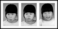
| 05/07/2007 07:34:38 AM |
Facial Expressionsby pla2Comment by timfythetoo: Greetings from the Critique Club -
Loved seeing this picture come up for me to comment on. I really enjoyed your model throughout the 30 days of portraits and I enjoyed this picture as well. I gave this shot a 6 in challenge. I think there are a couple of things that could have been changed to bring that score up.
You sure caught three nice expressions, but the change in framing on the last image really breaks the flow. The third image has such a strong expression that I think it would have fit better in the middle - even if the alignment of the girl in the image had been the same.
Well - I guess thats it. I think that is the biggest reason your image didnt break 6. The b&w conversion is nice, the frame is pretty cool (maybe a bit thinner on the black outer part) but overall it compliments your images nicely. Nice detail and a really cute girl. This is a just a really nice and pleasing image. Not a whopping stunner to bring you in the higher votes but really nothing drastically wrong either which shows in your tight vote spread. Not alot real high but no real low ones either.
Keep on with the good work. I look forward to seeing your future images!
Tim |
| Photographer found comment helpful. |
Home -
Challenges -
Community -
League -
Photos -
Cameras -
Lenses -
Learn -
Help -
Terms of Use -
Privacy -
Top ^
DPChallenge, and website content and design, Copyright © 2001-2026 Challenging Technologies, LLC.
All digital photo copyrights belong to the photographers and may not be used without permission.
Current Server Time: 07/16/2026 08:57:00 AM EDT.