| Image |
Comment |
| 06/19/2003 02:59:33 AM |
|
| 06/18/2003 06:27:14 PM |
|
| 06/18/2003 11:16:19 AM |
me and my panby jbruno1397Comment by diegohs: nice idea.. =) but you could have use a diferent background.. something more interesting related to cuisine.. =) |
| 06/16/2003 07:29:06 PM |
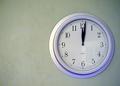
off center door of timeby jbruno1397Comment by carolee: I don't really feel the off-centeredness of this subject adding anything to the photo. Might help to get closer to the wall and shoot across the clock instead of straight at it. As it is, this image doesn't really say a lot, in my opinion. Maybe because everything about it is formal except the extra white space on the left? |
| 06/16/2003 03:43:45 PM |
|
| 06/16/2003 03:39:12 PM |
|
| 06/16/2003 02:06:38 PM |
|
| 06/16/2003 12:43:07 PM |
gooby jbruno1397Comment by Toddh: Critique Club
Hi Johnothan,
intersting image and choice of cropping. It is certainly abstract and I think it probably scored lower than it should have. I like the design.
One thing that does detract from the image is the couple of little white spots on the inner two swirls. I take it that the big white spot is the reflection of the lamp you used to light the picture. I think it both adds and detracts from the image. Firstly I think it adds something to the surface effect giving a sense of the irregularities in the surface, though at the same time it is distracting and probably cost you a few votes. It seems fairly grainy which may have been the effect you were going for. Personally I think I would have perhaps used a longer exposure to lift the image a bit and moved the lighting source out of the direct line of the shot.
Perhaps a longer exposure at a lower ISO would have reduced the grain. Finally increase the saturation to make the colours a bit more vivid.
Compositionally, I think it is a good abstract and thew swirls do lead your eye to the centre of the image.
I think it would be worth reshooting this to see what else you could get out of it.
Overall I think a few technical and compositional changes would have resulted in better scores for this image.
Thanks for sharing your image and keep shooting.
Cheers,
Todd. |
| 06/16/2003 10:21:47 AM |
off center door of timeby jbruno1397Comment by alanfreed: Nice & sharp & simple... although perhaps not the most exciting of subjects. There seems to be a little excessive grain (just a teeny bit), and the reflection in the clock is a little distracting. |
| 06/16/2003 04:57:19 AM |
|
Home -
Challenges -
Community -
League -
Photos -
Cameras -
Lenses -
Learn -
Help -
Terms of Use -
Privacy -
Top ^
DPChallenge, and website content and design, Copyright © 2001-2026 Challenging Technologies, LLC.
All digital photo copyrights belong to the photographers and may not be used without permission.
Current Server Time: 04/01/2026 10:35:32 AM EDT.