| Image |
Comment |
| 04/22/2009 03:24:29 PM |
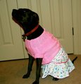
Mrs. Kittyby C4PicturesComment by quackquack: This could have been more interesting if you had employed a different angle. It meets the challenge, but there isn't any artistic photographic element to it. |
 Photographer found comment helpful. Photographer found comment helpful. |
| 04/22/2009 06:20:38 AM |
|
| Photographer found comment helpful. |
| 04/22/2009 04:52:36 AM |
|
| Photographer found comment helpful. |
| 04/22/2009 02:25:48 AM |
|
| Photographer found comment helpful. |
| 04/21/2009 09:34:10 PM |
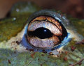
Eye See Youby C4PicturesComment by goinskiing: Great detail overall. What I think really could have made it pop out more would have been a bit wider crop. In the set up, I would have tried to find a way to get a little more even lighting (I'm not sure if you have an external flash, but bouncing off the ceiling works wonders this way) as it seems a tad harsh making some parts a little dark making it lose some of the details. I would have adjusted the shot to have made the brights a tad brighter along with the midtones and then to darken the shadows. This would have the tonal range larger allowing for other surprising details to pop. This can be done in post processing messing with the curves in RAW. The concept, idea, and composition overall are definitely there, from here it's fine tuning which just takes practice and lots of it. You're definitely on the right path mate, keep up the good work!
ETA: Maybe finding a way to control the noise too would help. Also, to get greater contrast you can play around with setting with the unsharp mask, you'd be amazed at some of the results you'll get after experimentation. Message edited by author 2009-04-21 21:35:44. |
| Photographer found comment helpful. |
| 04/21/2009 09:23:00 PM |
Eye See Youby C4PicturesComment by LadyK: eoe! only a 5.6? im shocked. the only dinky thing i might have been to chenge the comp to work more with the rule of thirds(i usually ignore the rule, but it might have been nice here). also, i would have blurred out the grain in the background, but i believe thats illegal in basic, so ignore that one:) |
| Photographer found comment helpful. |
| 04/21/2009 08:06:40 PM |
Eye See Youby C4PicturesComment by bvlindalou: imho I think the eye is too centered.....maybe put it in the top right corner? maybe that would take out the distracting top right background......hope this is helpful :) |
| Photographer found comment helpful. |
| 04/21/2009 07:32:02 AM |
|
| Photographer found comment helpful. |
| 04/19/2009 09:19:46 AM |
|
| Photographer found comment helpful. |
| 04/18/2009 05:28:32 PM |
|
| Photographer found comment helpful. |
Home -
Challenges -
Community -
League -
Photos -
Cameras -
Lenses -
Learn -
Help -
Terms of Use -
Privacy -
Top ^
DPChallenge, and website content and design, Copyright © 2001-2026 Challenging Technologies, LLC.
All digital photo copyrights belong to the photographers and may not be used without permission.
Current Server Time: 08/15/2026 04:50:57 PM EDT.