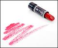
Cinnamon Redby
StevePaxComment by autool: Critique Club Critique
Title: "Cinnamon Red" by StevePax
Composition: A very original and well-composed shot. The overall result is that of a commercial picture for advertisement. I feel the negative space adds to this picture giving it a hot feel.
Technical: All of the ingredients for a perfect photo are in this one. You show very good control of light and have used it to your advantage. The focus seems to be ever so slightly off, that may have been on purpose, but I feel the lettering would be absolutely sharp if it were to be used as a commercial picture. I keep going beck to that commercial thing but it just has that effect on me.
Challenge: You have met the challenge, however I think most entries were centered around using all three primary colors. Nothing said it was necessary though. Your use of only red gives it what I call simple elegance.
Suggestions: I think the subject in your picture narrows the field of viewers that would be very interested in having it on their wall. It definitely has a place though, which I have mentioned already. I a deserved 7 on this entry, and only whish I could accomplish the control of light that you have. Your "Orange County, CA" postcard entry is another very nice example of light control. It has been a pleasure to critique your work, so keep shooting and have fun!
Dick
Disclaimer:
Bear in mind that I am here to learn, just as many others and any comments that I have made are not intended to be offensive in any way, and are only constructive criticisms. If you wish to comment or discuss this critique please feel free to do so at any time.
Thank you,
Dick Pattee (Autool)
Autool@attbi.com