| Image |
Comment |
| 03/28/2007 01:03:19 AM |
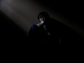
the Holy Grailby MuppetComment by jackal9: Holy Grail, love the title!! I like the angle and the lighting and do not agree with the OOF comment, I think it looks fine!! very creative and good comp. I think you got ripped on this one...I would give it a 6 or 7. My only real thought to improve might be to get rid of the bottle of whatever it is on the shelf in the upper left corner, that is a bit distracting to me, IMO. |
 Photographer found comment helpful. Photographer found comment helpful. |
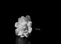
| 03/23/2007 10:37:06 PM |
Shine Your Lightby MuppetComment by shalrath: I think I'd prefer a little more negative space into the top right, to give a bit of a lonely feel. The reflection seems to fit though, it gives the sense that the flower is actually sitting somewhere. Perhaps you could include a little more of that 'somewhere' (in VERY low key of course). |
| Photographer found comment helpful. |
| 03/21/2007 03:17:04 PM |
the Inner Painby MuppetComment by Melethia: To address the too dark issue - when I see something on my main monitor that is "too dark", I check it on another monitor I have that is lighter. This one works on both monitors for me, though the second one does reveal a bit more. You made the picture you wanted, which is good, but you must also (for the sake of DPC only, not for your own purposes) make sure you take into account the wide range of monitors on which folks view these pictures. If you don't mind "too dark" as a comment, then that's cool.
For the picture, I like your "everyone has one of these, this is mine" comment. It means that you set out to do something specific and were pleased with the results. In my opinion, that's 90% (or more) of what we should all get out of photography. It is nice if someone else sees it, too, and from some of your comments, a few others did. I like the dual aspect of grain for the challenge - in the darkness there's grain, and there's the grain of the paint on the wall. I LOVE the wee bit of diagonal light - that's a particular favorite of mine. And while you mention you should probably have been more judicious in your choice of shirt to wear, I think the bit of color from the one you have on is perfectly placed in the frame.
I agree with dahkota's comments about the centering (and understand that you couldn't really change it, based on your comments in the thread.) Emotive shots like this can benefit by leaving more space on one side or another, or even at the top sometimes. Though that said, I'm not against centered compositions. Not everything works on the rule of thirds.
Key takeaways - you got what YOU wanted out of the shot and you got some useful feedback with respect to how others see (or don't see) what you tried to convey. I'll keep watching for your challenge entries! |
| Photographer found comment helpful. |
| 03/21/2007 06:42:11 AM |
the Inner Painby MuppetComment by dahkota: This just goes to prove how many people out there do not calibrate their monitors. If they had, you would have added at least a point to your score. I've learned the hard way too. That said, I like the image and gave it a 7. Didn't have time to come back and bump, which I may have. I looked past the title which, I agree with Ed, is a little pretentious. The composition bothers me in that the subject is centered but I don't think cropping on either side would work well. You need all those shadows here - they work amazingly well and in fact are a subject unto themselves. Maybe pulling back a little further, giving the subjects more room, would be the way to go. Then you can pull him off the right just a tad, to add a little more tension to an already tense scene. You did well here and this is under-rated. The diagonals emphasize his 'down-ness' very well as do the tones of the image. Not sure of the color or not - that one little spot in the shirt is a little distracting but the jeans aren't. Or its just me. Anyway, good work - look past the scores - you just never know with this crowd. |
| Photographer found comment helpful. |
| 03/21/2007 02:08:55 AM |
the Inner Painby MuppetComment by klstover: I love the darkness. I think maybe non-calibrated moitors hurt you, as you did get comments saying that people could barely see things. It's always a risk entering something so dark. But the way that the light comes in.. the angle of it, and the spot where it appears.. it is all very lovely. I agree that maybe there is a tad too much negative space - perhaps a tighter crop on the bottom and right would be better. I love the blue tones as well - helps with the cold, moody feel. |
| Photographer found comment helpful. |
| 03/21/2007 01:46:59 AM |
the Inner Painby MuppetComment by Muppet: ok, for all of you who complained about the photo being too dark for you, well yeah, depression is pretty dark, and i intended for this image to be dark for that very reason. so even though i recognize your opinion on this matter, and therefore marked your comment as helpful, you should all keep in mind that the lighting did exactly what it was supposed to do. my pic did have other flaws that i could have worked out, but the darkness was not one of them. thanks for looking at my pic though :) |
| 03/20/2007 11:16:04 AM |
|
| Photographer found comment helpful. |
| 03/20/2007 11:15:29 AM |
the Inner Painby MuppetComment by Blackstarlight0: the image is very dark I almost didnt realize there was anything there. it's not the best but it isn't bad. maybe brighten it up a little more and it could grab my attention a little better. |
| Photographer found comment helpful. |
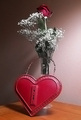
| 03/20/2007 02:04:03 AM |
Opening my heart again...by MuppetComment by MelonMusketeer: Good set up, but needed more light on the rose to get it to work right IMHO.
That's an old looking box. This is a good group of items for an image. A pillow or something to get the box up to the level of the rose would have made a more compact looking arrangement. |
| Photographer found comment helpful. |
| 03/18/2007 12:55:21 PM |
|
| Photographer found comment helpful. |
Home -
Challenges -
Community -
League -
Photos -
Cameras -
Lenses -
Learn -
Help -
Terms of Use -
Privacy -
Top ^
DPChallenge, and website content and design, Copyright © 2001-2026 Challenging Technologies, LLC.
All digital photo copyrights belong to the photographers and may not be used without permission.
Current Server Time: 07/17/2026 07:47:06 PM EDT.