| Image |
Comment |
| 01/04/2006 01:50:25 AM |
|
 Photographer found comment helpful. Photographer found comment helpful. |
| 01/04/2006 01:45:02 AM |
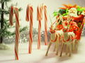
Solstice Shadowsby melismaticaComment by loseme: Personally I liked the shot, I was also in the same category giving you a 6. This is a really great idea, I think the composition could have been better. Possibly a tighter shot excluding the shadow on the right hand side completely and shortening the length of the leg and cropping the top some. Beyond that I like the colors that are shown in the background. I am not sure how it fits into the pattern category and I think that is probably what hurt it the most, people I think were really expecting to see a nice neat pattern. |
| Photographer found comment helpful. |
| 01/04/2006 01:41:33 AM |
Solstice Shadowsby melismaticaComment by GIS_boy: I think you had a good idea however I think the item you featured could have been more interesting maybe.
I also think the shadow to the right of the featured item is not good. Another thing that could have improved the photo would be a stronger composition. Always try to apply the rule of thirds when you can.
I hope this helps a little and hope to see you enter another photo soon. |
| Photographer found comment helpful. |
| 01/04/2006 01:35:04 AM |
Solstice Shadowsby melismaticaComment by Cyndane: The thing about your photo was that it didn't really grab me. I think it was a good idea, but the block of shadow on the right and along the top take away from it. As does the leg of the table extending straight down from the plant pot. The bumpy wall kind of takes away too.. But the main thing was that I didn't really see a "pattern". It seemed like a pretty quick shot, that didn't require a whole lot of effort. Please don't think I'm being mean or overly-critical.. just telling you why I voted the way I did, since you asked. :) Message edited by author 2006-01-04 01:35:22. |
| Photographer found comment helpful. |
| 12/31/2005 10:44:40 PM |
|
| Photographer found comment helpful. |
| 12/28/2005 11:10:09 PM |
|
| Photographer found comment helpful. |
| 12/22/2005 07:52:34 PM |
|
| Photographer found comment helpful. |
| 12/22/2005 02:59:52 PM |
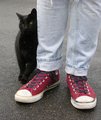
Mineby melismaticaComment by macrothing: Like the colors and composition. I think that if this were more tightly cropped at the top to eliminate that 'white' mark and the cat was in focus and the main 'feature' here (rather than the jeans/shoes), would have made this better in my opinion. A different angle, again - to get the cat at a different, more dominant angle, would likely have helped too, but depends what you were trying to achieve. |
| Photographer found comment helpful. |
| 12/21/2005 10:42:03 PM |
|
| Photographer found comment helpful. |
| 12/21/2005 01:43:42 AM |
|
| Photographer found comment helpful. |
Home -
Challenges -
Community -
League -
Photos -
Cameras -
Lenses -
Learn -
Help -
Terms of Use -
Privacy -
Top ^
DPChallenge, and website content and design, Copyright © 2001-2026 Challenging Technologies, LLC.
All digital photo copyrights belong to the photographers and may not be used without permission.
Current Server Time: 07/16/2026 12:53:57 PM EDT.